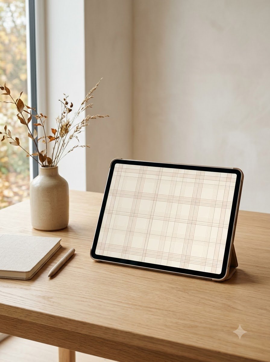
There’s something about fall that makes me want to make everything around me feel a little cosier. Even my phone.
A few years ago, I remember changing my wallpaper on a random October evening because my usual bright background suddenly felt completely wrong. I wanted something warmer. Something that looked like chunky sweaters, cinnamon, old books, and a quiet afternoon with a mug sitting beside me. I ended up choosing a simple brown plaid pattern, and honestly, it made my phone feel strangely more inviting.
Since then, I’ve become a little obsessed with seasonal wallpapers, especially plaid.
Plaid works so well for fall because it gives you that cozy feeling without needing pumpkins or obvious autumn illustrations everywhere. A simple pattern in brown, cream, rust, pink, green, or even muted purple can completely change the mood of a screen.
So I put together 22 fall plaid wallpaper ideas that I’d happily use on an iPhone, iPad, or laptop. Some are soft and feminine, some feel rustic, and a few have that slightly vintage look I keep coming back to.
1. Classic Brown and Cream Plaid
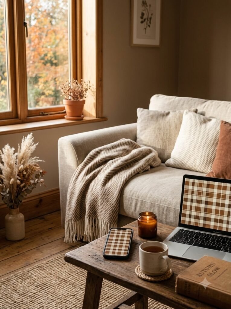
If I had to pick one fall plaid wallpaper to start with, it would probably be brown and cream.
It reminds me of an old wool blanket folded over the arm of a sofa. The combination feels warm without being too dark, and it works especially nicely with simple app icons.
For an iPhone, I like a medium-sized plaid rather than an extremely tiny check. The larger pattern stays visible behind the clock and widgets.
On a laptop, you can go a little bolder with the pattern.
2. Chocolate Brown Plaid
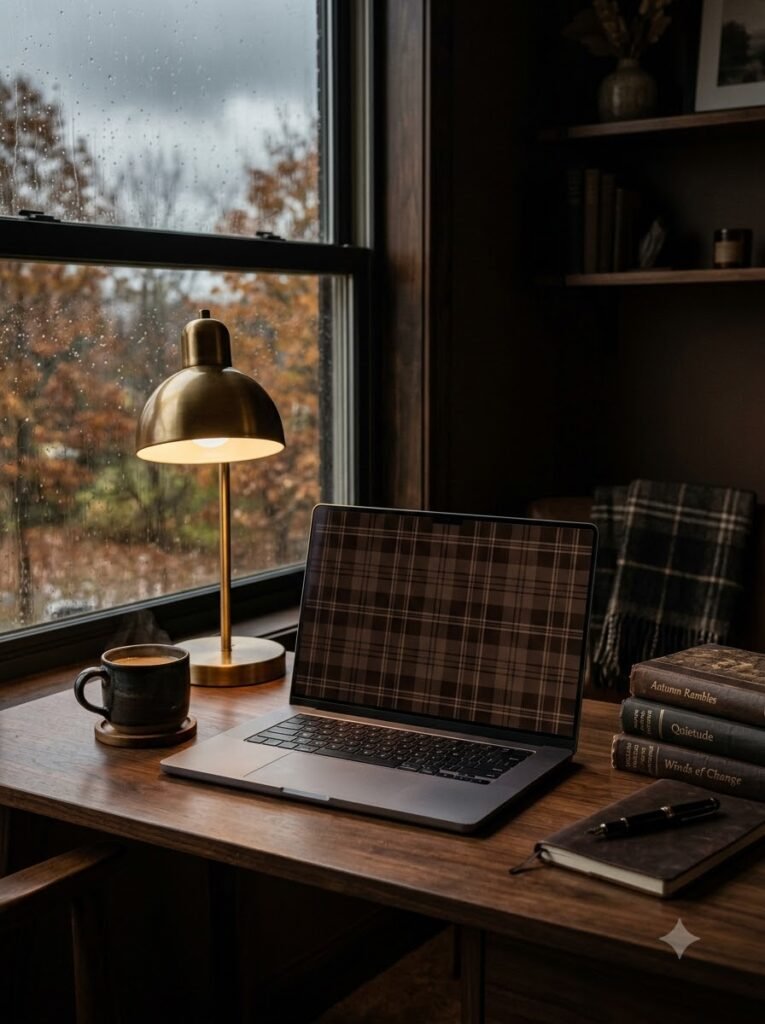
Chocolate brown has such a cozy quality to it.
I like using a deeper brown plaid when I want my screen to feel calm rather than cheerful. Think dark chocolate, espresso, wooden furniture, and a rainy afternoon.
A tip I learned from trying darker wallpapers: leave some quieter space near the center if you have lots of icons. Otherwise, everything can start looking a little busy.
3. Blush Pink and Brown Plaid
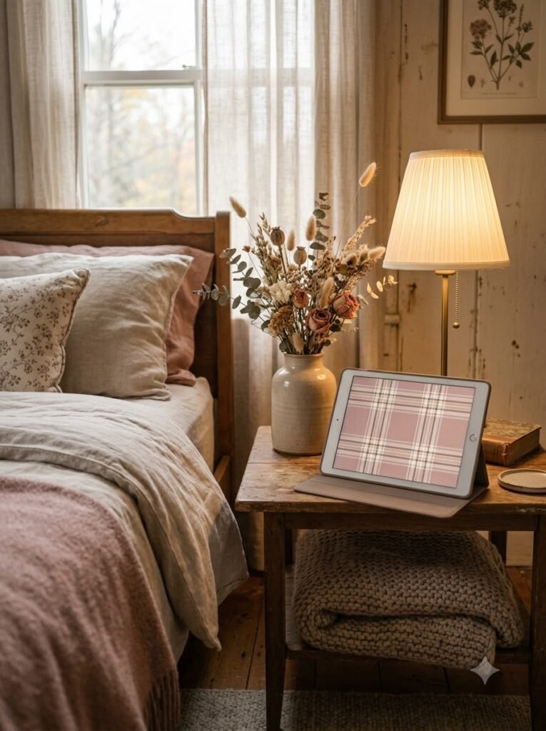
This is probably my favorite combination when I want fall decor without going completely rustic.
Soft blush pink mixed with warm brown gives plaid a sweeter, more delicate feeling. It looks especially pretty on an iPhone with cream-colored widgets.
I’d pair it with:
- Beige widgets
- Simple black or brown icons
- A small handwritten-style quote
- Neutral lock-screen elements
It feels autumnal, but not in an obvious way.
4. Dusty Rose Plaid
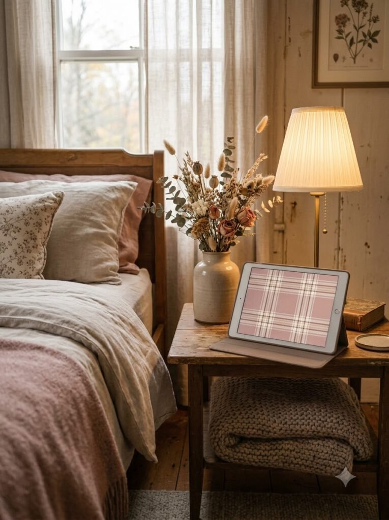
Dusty rose is one of those colors I never really get tired of.
For a fall wallpaper, I’d choose a muted rose rather than bright pink. Add thin lines of cream, taupe, or brown, and suddenly the whole pattern feels soft and vintage.
I could easily imagine this on an iPad sitting on a bedside table, especially with a warm lamp nearby.
5. Rust and Cream Buffalo Plaid
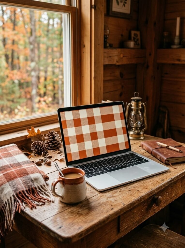
For something more traditional, I’d go with rust-colored buffalo plaid.
The larger squares give it that classic cabin feeling. It reminds me of flannel shirts and weekend trips somewhere with lots of trees.
This one is particularly nice for a laptop because the larger screen gives the pattern room to breathe.
If your desktop has a lot of folders, though, I’d keep the plaid slightly muted so the icons remain easy to find.
6. Taupe and Beige Plaid
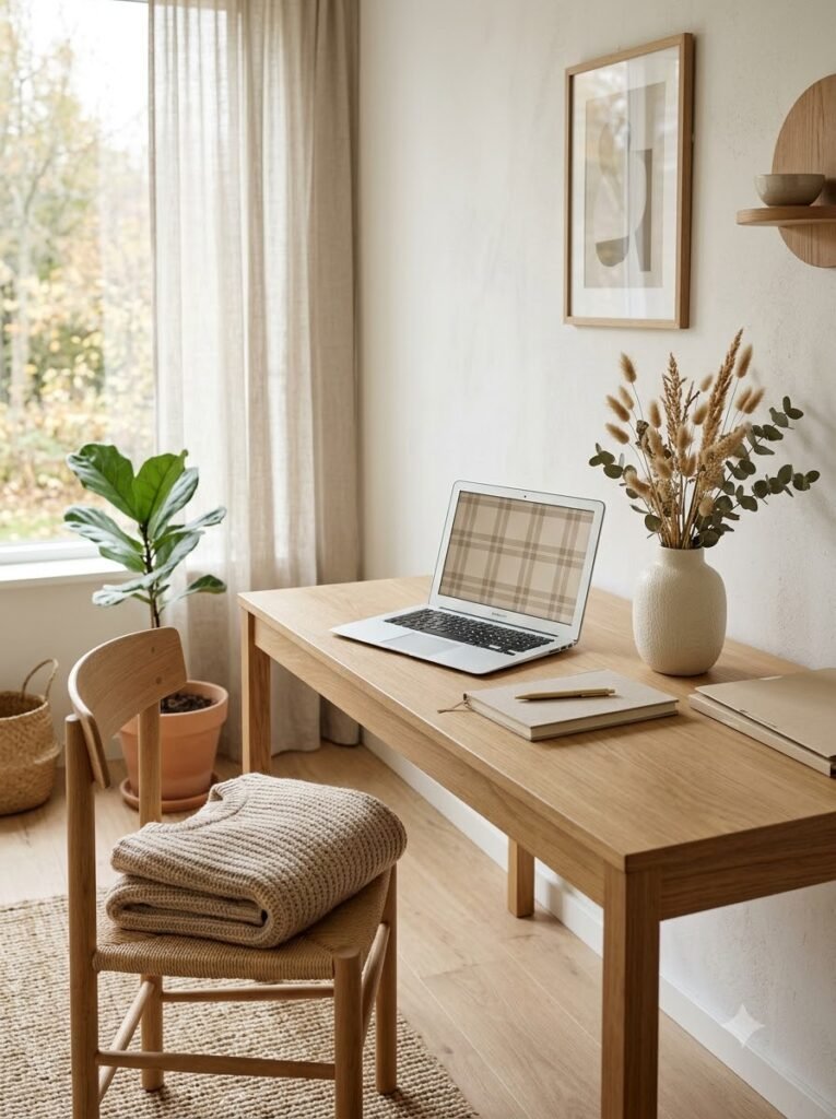
Not every fall wallpaper needs strong autumn colors.
Taupe and beige plaid is subtle, and I actually love that about it. When I want my screen to look clean but still seasonal, this is usually the direction I take.
It works beautifully with minimalist home screens and neutral productivity setups.
I’d describe it as the wallpaper equivalent of a beige knit sweater. Simple, comfortable, and somehow always appropriate.
7. Pink, Burgundy, and Cream Plaid
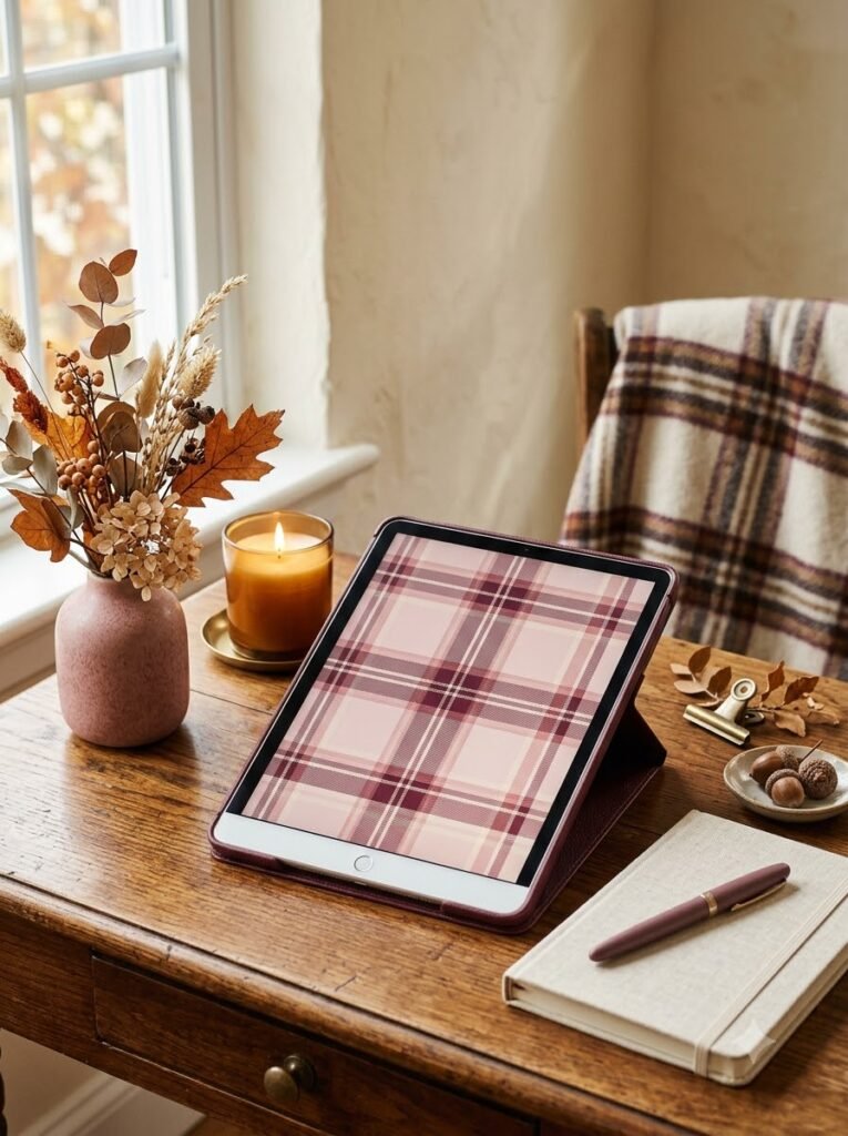
This combination feels a little richer.
The burgundy adds depth, while pink and cream keep the design from becoming too heavy. I especially like it for October and November, when I want something that feels distinctly fall but still pretty.
One thing I’d recommend is choosing a slightly faded version of the colors. Very saturated burgundy and pink can make a wallpaper feel more like a holiday pattern than an autumn one.
8. Sage Green and Brown Plaid
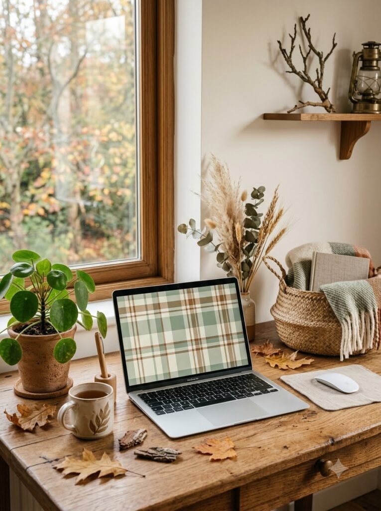
I know green isn’t the first color most people associate with fall, but hear me out.
Sage green paired with brown and cream looks incredibly cozy. It has a more natural, outdoorsy feeling, almost like moss, bark, and dried leaves.
This is a good choice if orange and red aren’t really your colors.
I’ve found that muted green wallpapers also work nicely with wooden desks and plants, so the whole workspace feels connected.
9. Cottagecore Fall Plaid
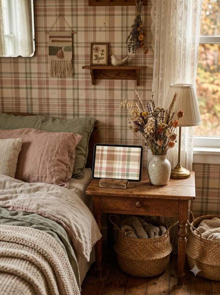
For anyone who loves cottagecore, I’d make the plaid slightly imperfect-looking.
Think faded brown, cream, dusty pink, and maybe a tiny hint of sage. A woven or fabric-like texture makes it even better.
I like wallpapers that don’t look digitally perfect. Something with a subtle paper or textile texture can make the screen feel much warmer.
It’s a small detail, but I notice it every time.
10. Tiny Brown Gingham
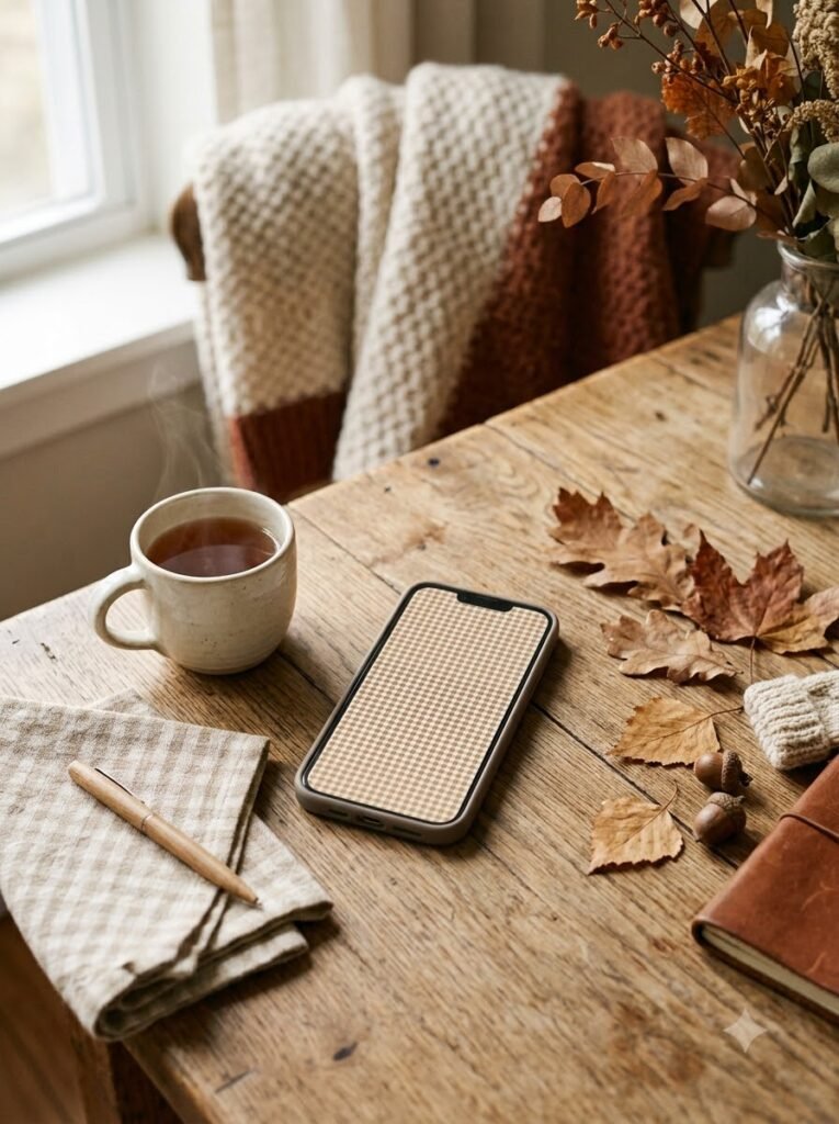
Gingham is technically a little different from traditional plaid, but I’m including it because it gives a similar cozy effect.
A tiny brown-and-cream gingham pattern feels like a picnic cloth that somehow wandered into autumn.
This one is especially cute for an iPhone.
If you’re worried about the pattern becoming overwhelming, choose a very pale cream background with soft brown lines rather than high contrast.
11. Oversized Neutral Plaid
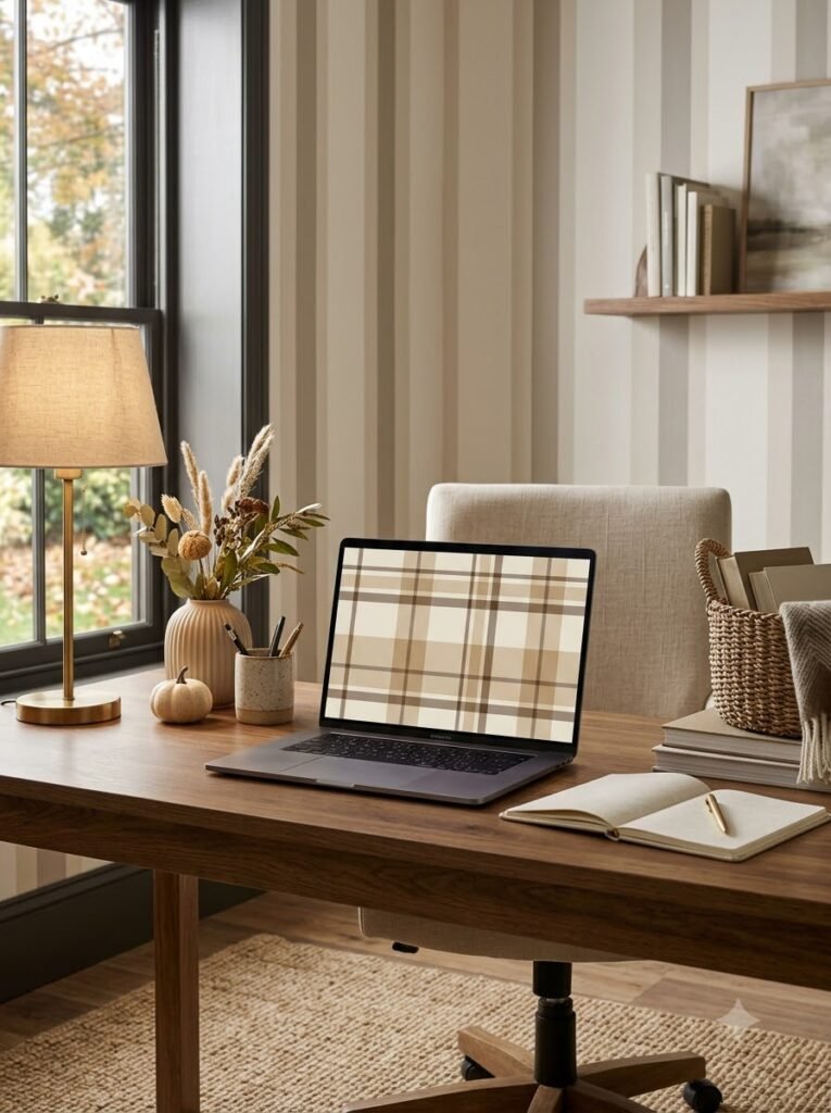
Sometimes bigger really is better.
An oversized plaid with broad beige, tan, and brown stripes can look surprisingly elegant. I’d use this on a laptop or iPad rather than a phone, where the larger pattern has more space.
I especially like this idea for a home office. It gives the background a little personality without competing with everything else on the desk.
12. Pink and Burgundy Preppy Plaid
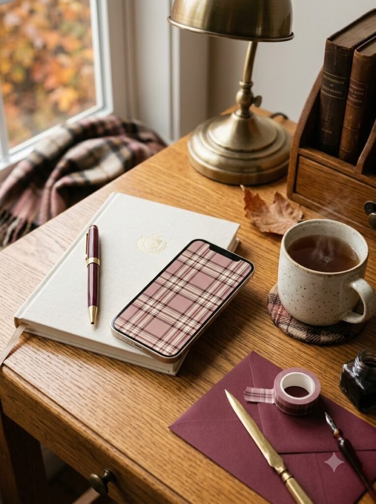
This one has a slightly preppy, school-inspired feeling.
Imagine dusty pink, burgundy, cream, and maybe a thin dark brown line running through the pattern. It feels playful but still grown-up.
I’d probably use this on a phone during the fall months and switch it out once winter arrives.
That’s one thing I enjoy about seasonal wallpapers: they don’t have to be permanent.
13. Dark Brown and Black Plaid
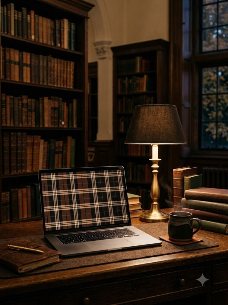
For a moodier look, try combining chocolate brown with black and warm beige.
It has a cozy library feeling to me. I picture a wooden desk, an old lamp, and a stack of books nearby.
Because this wallpaper is darker, it can also be practical if you spend a lot of time looking at your screen in the evening.
I’d just make sure the icons have enough contrast to stay readable.
14. Cream Plaid with Tiny Orange Lines
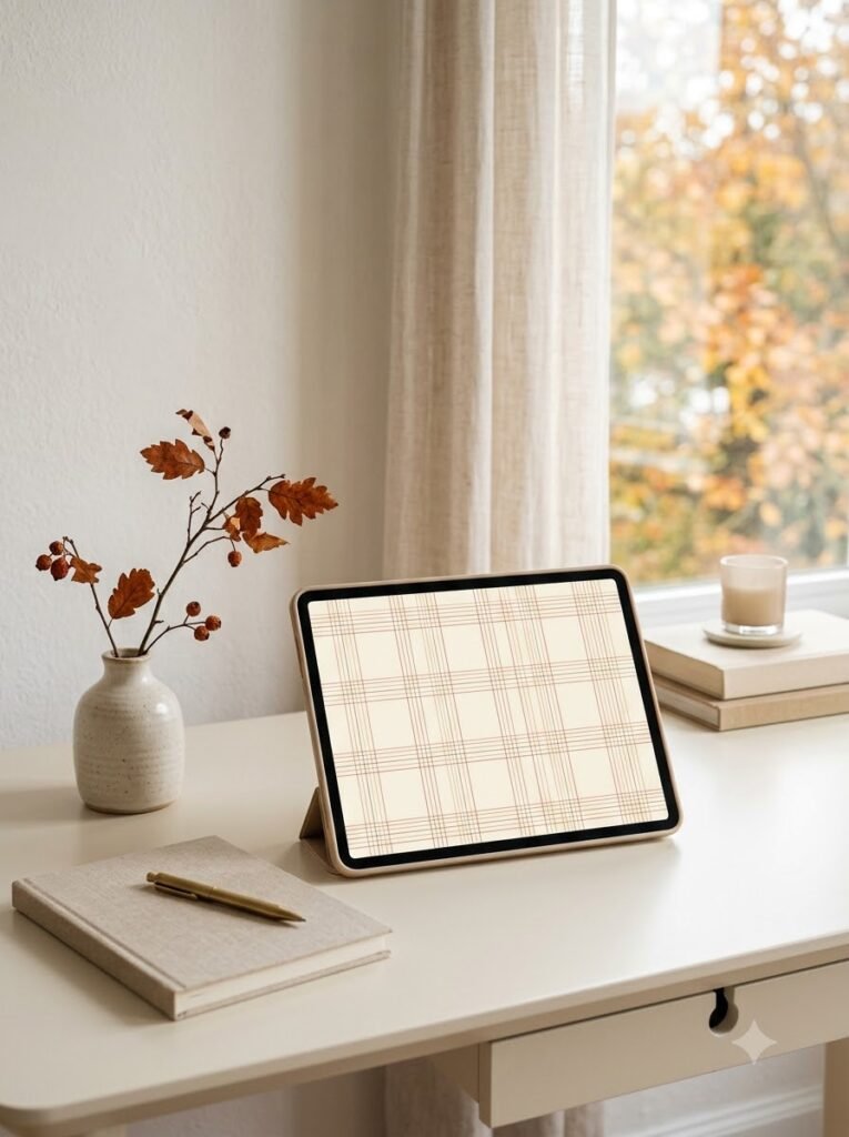
This is a very gentle way to bring fall onto your screen.
Start with a warm cream background and use thin lines of burnt orange, brown, and perhaps muted red. The result is seasonal without shouting, “IT’S FALL!”
I tend to prefer wallpapers like this when I’m using lots of widgets because there’s enough visual breathing room.
15. Vintage Faded Plaid
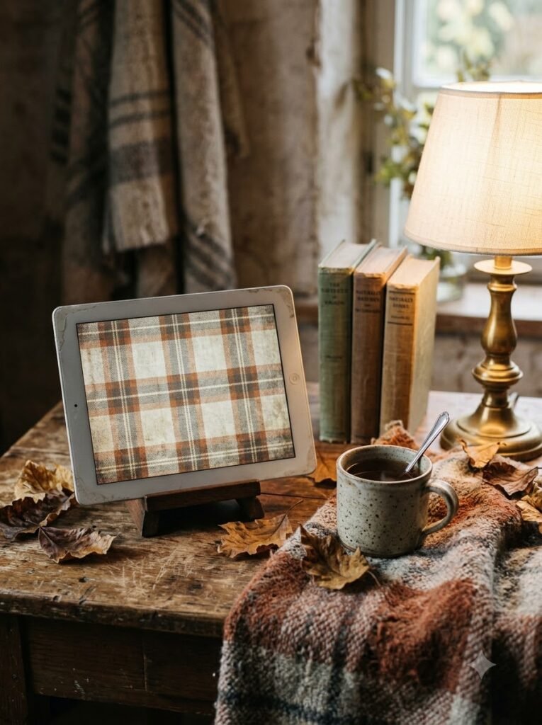
This is one of those wallpapers that looks better when it isn’t perfect.
A faded plaid pattern with slightly washed-out brown, rust, cream, and gray can give your device an old-fashioned, nostalgic quality.
I’d look for a texture that resembles worn fabric or an old blanket.
The little imperfections are what make it charming.
16. Terracotta and Blush Plaid
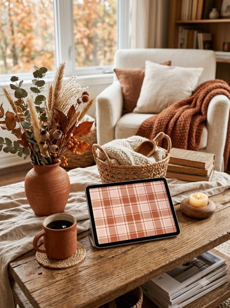
Terracotta is such a beautiful fall color, and combining it with blush pink softens it nicely.
I’d add cream lines rather than stark white ones. Cream makes the entire palette feel warmer.
This would look lovely on an iPad sitting on a coffee table, especially if the room already has terracotta pottery, woven baskets, or warm wood.
17. Moody Plum Plaid
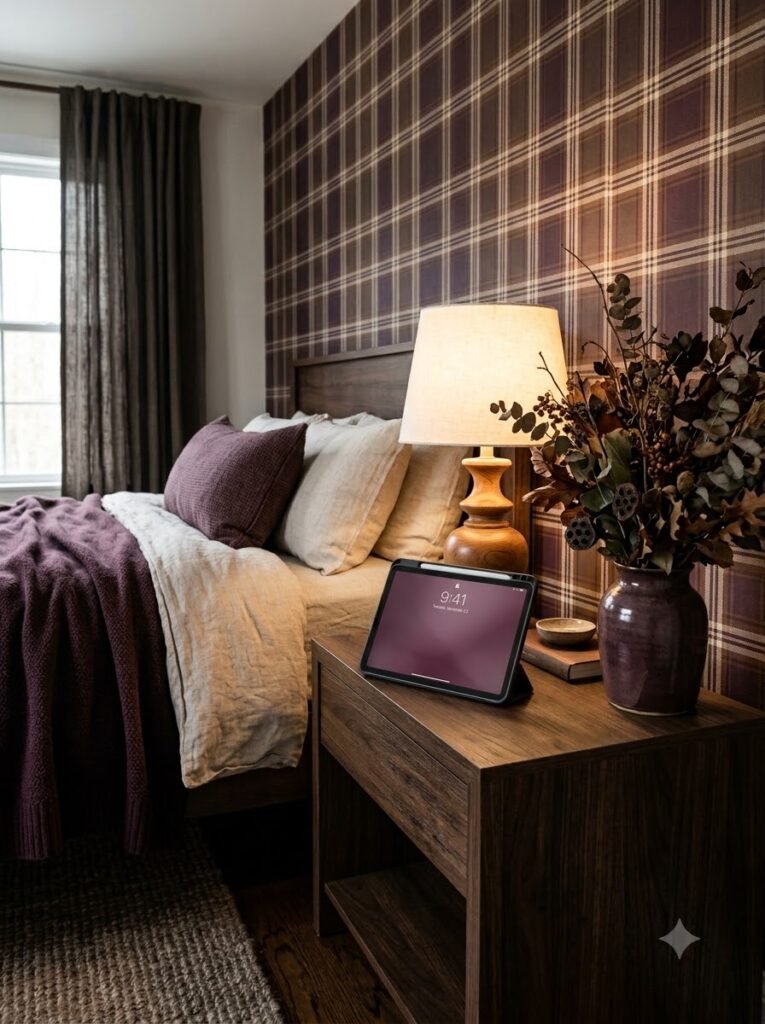
If you want something a little different, try plum.
A muted plum plaid mixed with brown and cream feels rich and slightly dramatic without being too dark.
I like this for late fall, when the days get shorter and everything naturally starts feeling a little more cocoon-like.
It’s also a nice alternative if you’ve already used every possible shade of orange and brown.
18. Soft Pink and Beige Plaid
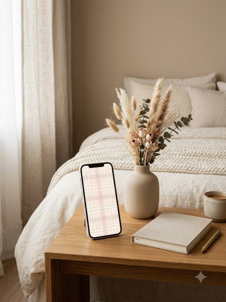
This is probably the most understated option on my list.
Soft pink plus beige gives you a warm, almost creamy background. There’s enough contrast to see the plaid, but it doesn’t dominate the screen.
I’d choose this if your home decor is mostly neutral and you want your devices to coordinate with it.
It’s also very forgiving. You can put almost any widgets or icons over it without creating visual chaos.
19. Rust, Olive, and Cream Plaid
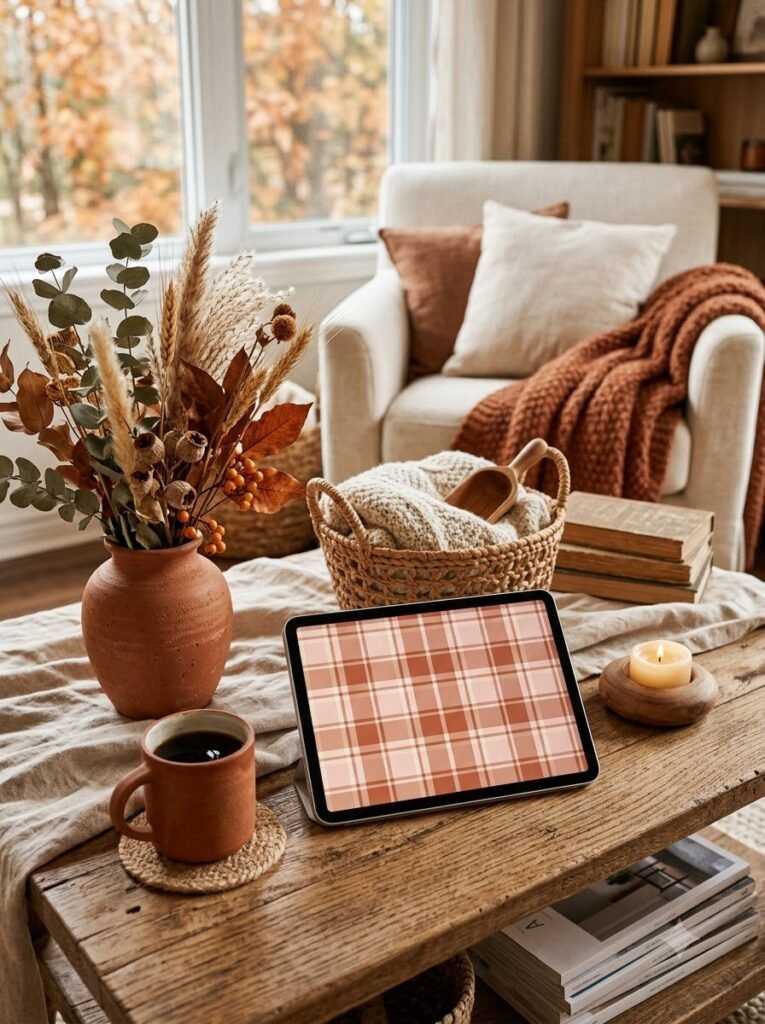
For a more earthy fall palette, combine rust with olive green and cream.
This reminds me of autumn leaves against fading greenery. It feels outdoorsy without being overly themed.
I especially like this palette for a laptop wallpaper because it has enough color variation to make a large screen interesting.
If you’re decorating a home office for fall, you could even repeat these colors through a throw blanket, plant pot, or desk accessories.
20. Minimal Line Plaid
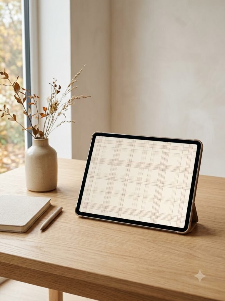
Sometimes I don’t want a big pattern at all.
A minimalist plaid made from very thin brown, beige, or blush lines gives just a hint of texture. From a distance it almost looks like a solid color, but when you look closer, the grid appears.
This is one of my favorite approaches when I have a lot going on visually.
It’s also a good choice if you like a clean, uncluttered home screen.
21. Cozy Flannel-Inspired Plaid
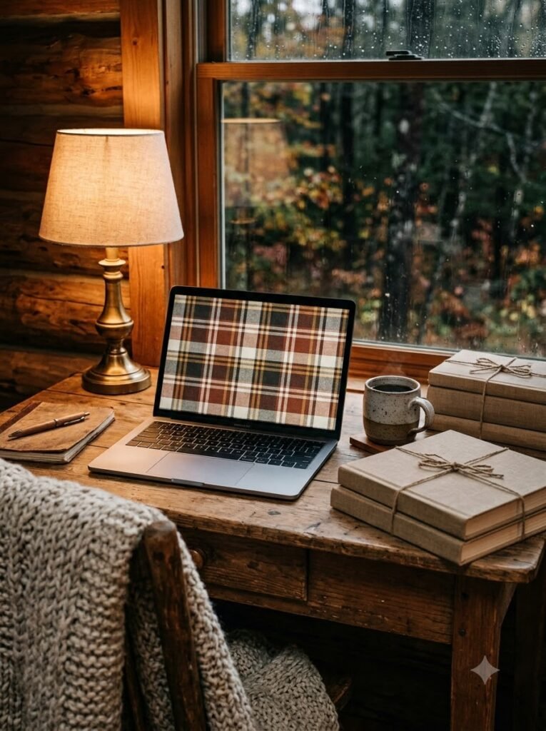
If you want your wallpaper to feel like a favorite fall shirt, go for flannel-inspired colors.
I’d try:
- Warm brown
- Muted red
- Cream
- A touch of charcoal
- Maybe a tiny line of mustard
The key is keeping the colors slightly softened. The goal isn’t a bright tartan; it’s that worn-in flannel feeling.
This one makes me want to put on thick socks and make something warm to drink. Which, honestly, is probably the point.
22. Neutral Plaid with a Soft Pink Accent
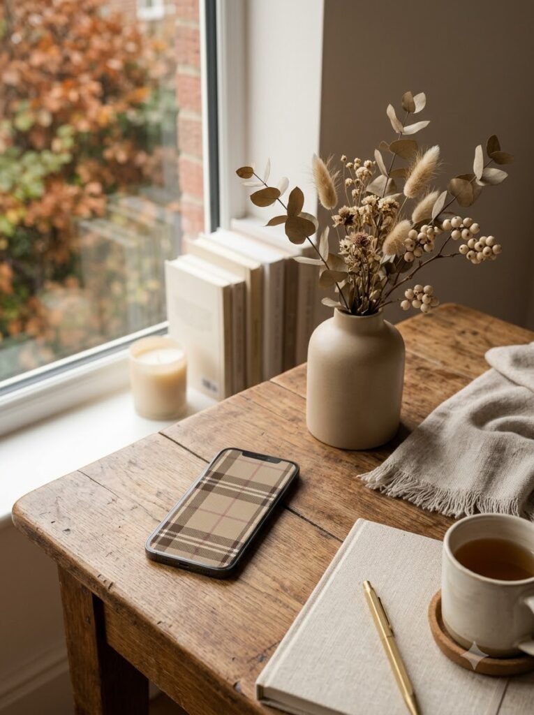
Finally, if you’re having trouble choosing between neutral and pink, you don’t have to.
Use a mostly beige and brown plaid, then add one or two thin dusty-pink lines.
I really like this approach because the pink doesn’t take over. It’s more like a little surprise hidden in the pattern.
It also makes the wallpaper easier to keep after fall. You could leave it on your device well into winter without it feeling too seasonal.
How I Choose the Right Plaid for My Devices
One thing I’ve learned is that the same wallpaper doesn’t always work equally well on every screen.
For my iPhone, I prefer:
- Larger or medium-sized patterns
- More empty space around the clock
- Muted colors
- Simple designs that don’t compete with widgets
For an iPad, I have a little more freedom. Medium and large plaid patterns both work well, especially if the screen is used for reading, journaling, or browsing.
For a laptop, I usually go for something more dramatic. A big plaid, vintage textile texture, or deeper color palette can make a plain desktop feel much more intentional.
A Few Easy Ways to Make a Plaid Wallpaper Feel More Personal
I don’t think you need to redesign your entire digital life every season. Sometimes a few tiny changes are enough.
Match Your Widgets
If your wallpaper has brown and cream tones, try beige or warm gray widgets. For pink plaid, dusty rose or cream works beautifully.
Don’t Be Afraid of Empty Space
This is something I learned the slightly annoying way.
A beautiful wallpaper can become useless if every inch is covered by app icons. Give the pattern some breathing room where possible.
Use One Accent Color
If the plaid already contains brown, pink, cream, and burgundy, you don’t need five more colors on top of it.
I usually pick one accent shade and let that guide my widgets and icons.
Think About Your Room
This might sound overly particular, but I like when my laptop wallpaper quietly echoes the room around me.
If my desk has warm wood and beige accessories, a brown plaid feels natural. If I have blush accents nearby, pink plaid makes more sense.
It creates a little visual connection between the physical and digital spaces.
My Favorite Fall Plaid Color Combinations
If you’re making your own wallpaper or searching for inspiration, these combinations are a good place to start:
- Chocolate brown + cream — classic and cozy
- Dusty pink + brown — soft and feminine
- Rust + beige — warm and rustic
- Burgundy + blush + cream — rich but pretty
- Sage + brown + cream — earthy and calm
- Terracotta + pink — warm with a softer edge
- Plum + beige — moody and unusual
- Olive + rust + cream — very autumnal
- Taupe + beige — understated and minimalist
Final Thoughts
I think the nicest fall wallpapers are the ones that make you feel something when you look at them.
For me, that’s the real appeal of plaid. It isn’t just a pattern. A certain combination of brown, cream, pink, or rust can bring back the feeling of a particular season almost instantly.
Sometimes I’ll change my phone wallpaper while sitting at my desk with a cup of tea, and that tiny five-minute project somehow makes the whole day feel a little more seasonal. It’s inexpensive, easy, and there’s no commitment. If I get tired of it in two weeks, I change it again.
If you’re choosing one for your own iPhone, iPad, or laptop, I’d start with the colors you already love in your home. Try chocolate brown and cream if you want classic coziness, dusty pink and brown if you want something softer, or sage and rust if you’re drawn to earthy colors.
And don’t worry too much about getting it “right.” Fall is probably the perfect season for things to feel a little worn-in, imperfect, and personal.
A simple plaid might be all your screen needs.