I used to think choosing bedroom colors was simple. You pick a paint swatch, throw on matching pillows, maybe add a throw blanket, and somehow the room magically looks like the Pinterest photo you saved at 1:30 AM.
That was… not my experience.
The first time I tried redesigning my bedroom, I painted the walls a trendy gray that looked “calm and sophisticated” online. In reality? My room ended up feeling like a rainy parking garage. Cold. Flat. Weirdly depressing after sunset. I remember sitting on my bed one evening thinking, Why does this room make me feel tired in the bad way instead of the cozy way?
That’s when I realized color schemes aren’t just about what looks pretty in photos. They completely change the mood of a space. Some combinations make a room feel soft and safe. Others make it feel expensive, airy, warm, creative, romantic… even bigger than it actually is.
And honestly, in 2026, bedroom color trends feel much more personal than before. People aren’t chasing “perfect” rooms anymore. They want spaces that feel comforting after long days. Spaces that feel lived in, calm, and emotionally warm.
I spent months collecting ideas, testing paint samples, rearranging decor, and probably overthinking bedding combinations way more than necessary. But along the way, I found some color schemes that genuinely transformed bedrooms in realistic, everyday homes — not just giant designer spaces.
So if you’ve been staring at your walls wondering what direction to go in, here are the dreamy room color schemes bedroom lovers are completely obsessed with right now.
1. Warm White + Soft Oak + Beige Layers
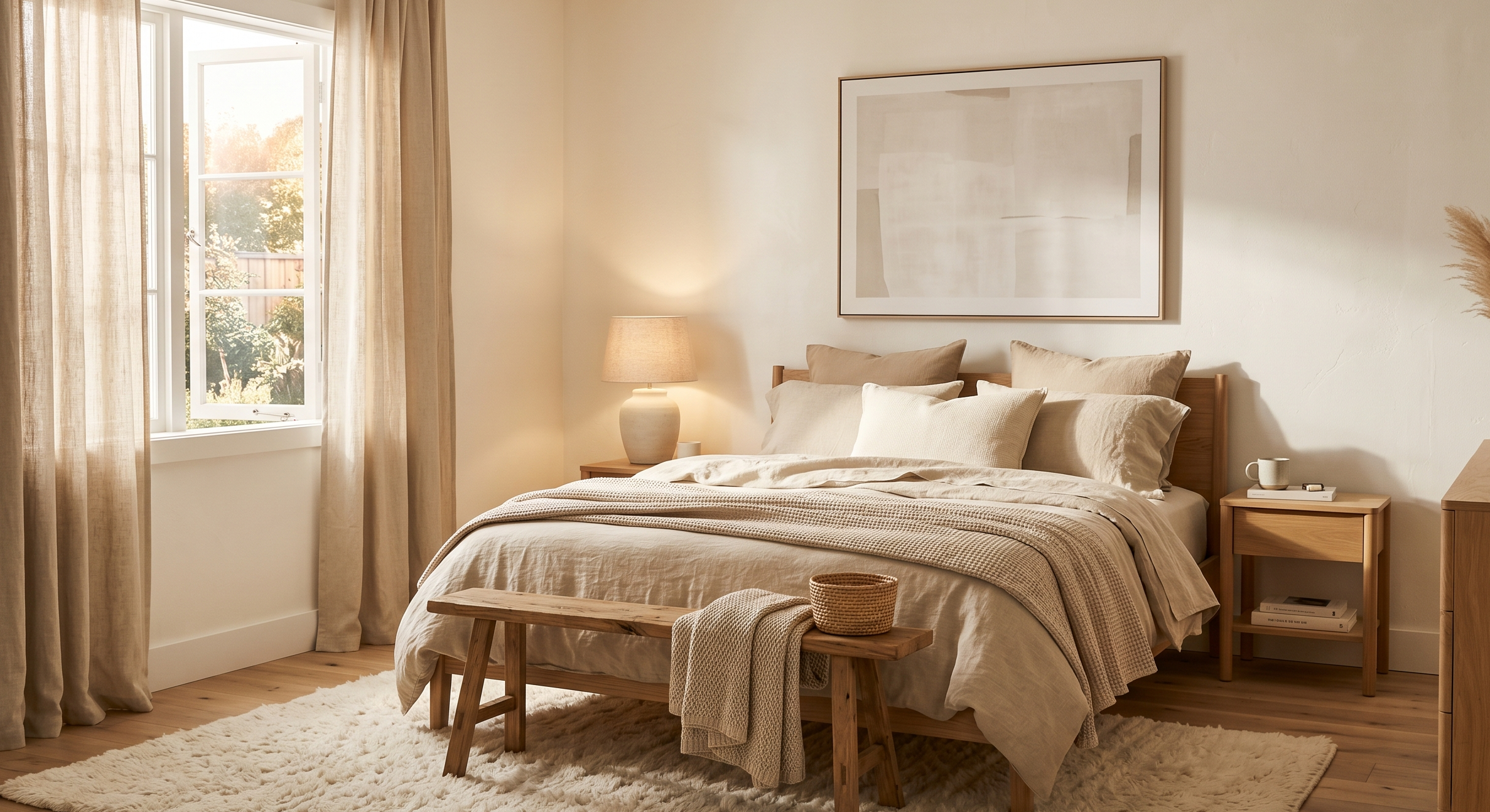
This combination feels impossible to mess up.
I tried this look in a small guest bedroom that barely got natural light, and somehow it instantly made the room feel brighter and calmer without feeling sterile.
The trick is using warm whites instead of icy whites. Think creamy vanilla instead of hospital white.
What works beautifully here:
- Warm white walls
- Light oak furniture
- Beige bedding
- Linen curtains
- Soft textured rugs
It gives that “expensive boutique hotel” feeling without needing expensive furniture.
2. Sage Green + Cream + Natural Wood
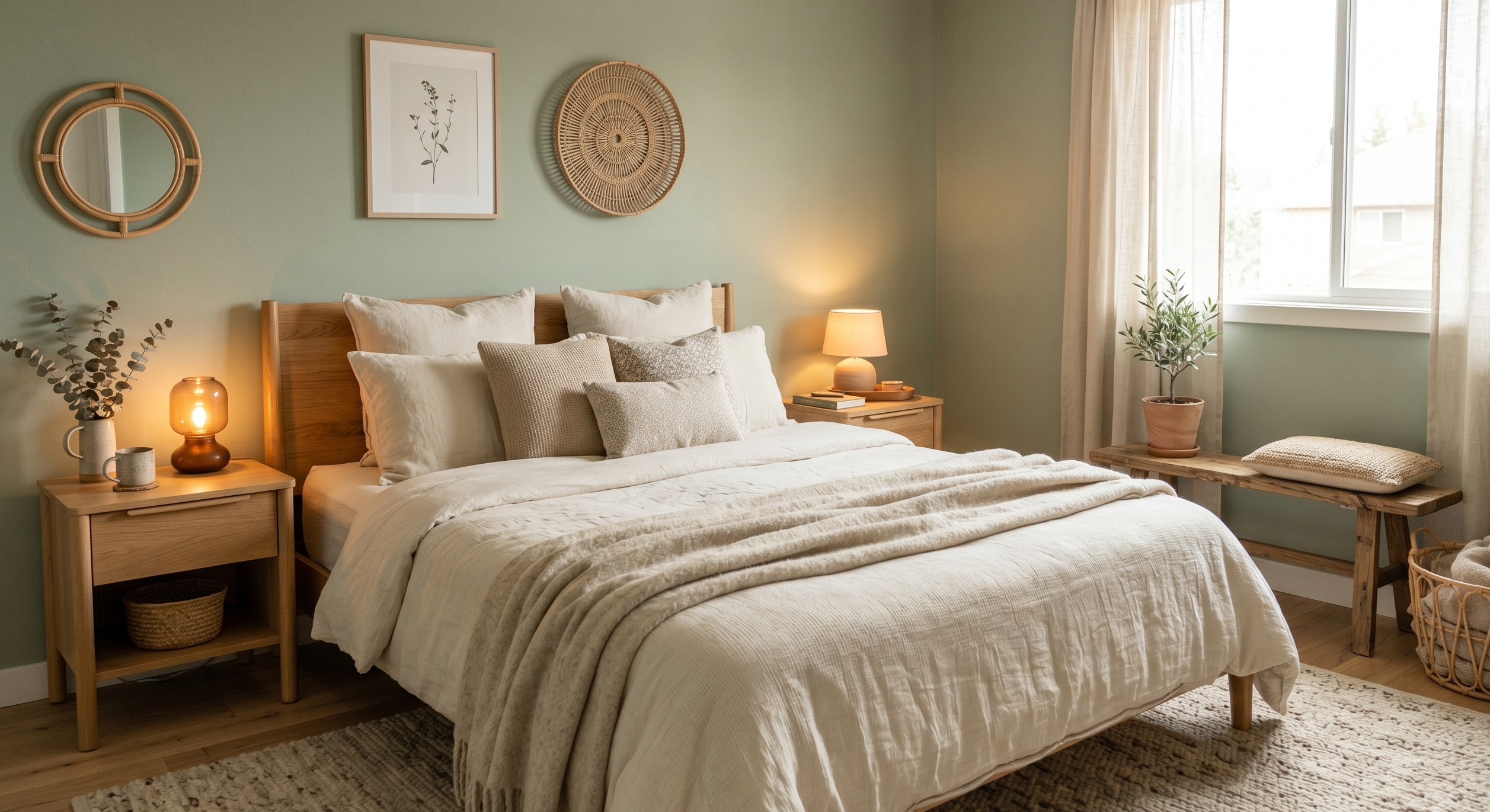
I swear sage green became popular because people are emotionally exhausted.
There’s something incredibly peaceful about it.
One of my friends painted her bedroom a muted sage shade last winter, and the room suddenly felt quieter somehow. Like your brain relaxes the second you walk in.
This scheme works especially well with:
- Cream bedding
- Rattan decor
- Light wood nightstands
- Warm lighting
And unlike darker greens, sage doesn’t overwhelm smaller bedrooms.
3. Dusty Blue + White + Brass Accents
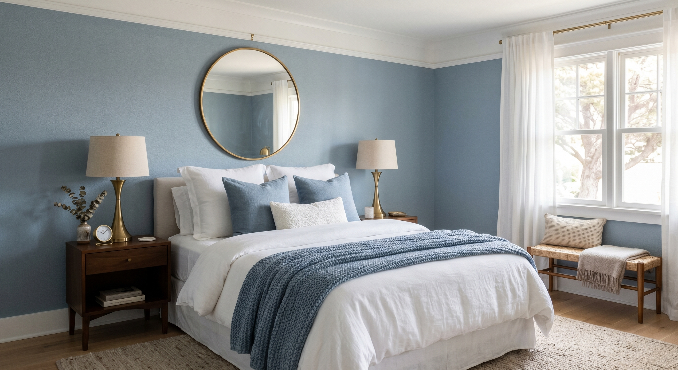
This one feels timeless.
Not trendy in the “this will look outdated next year” kind of way. More like the room belongs in a cozy coastal home where mornings are slow and peaceful.
I personally love dusty blue because it changes throughout the day. In morning light it feels airy. At night it becomes soft and cocoon-like.
Small brass accents help warm it up:
- Lamp bases
- Drawer handles
- Mirrors
- Picture frames
Without those warm touches, blue bedrooms can sometimes feel colder than expected.
4. Terracotta + Sand + Cream
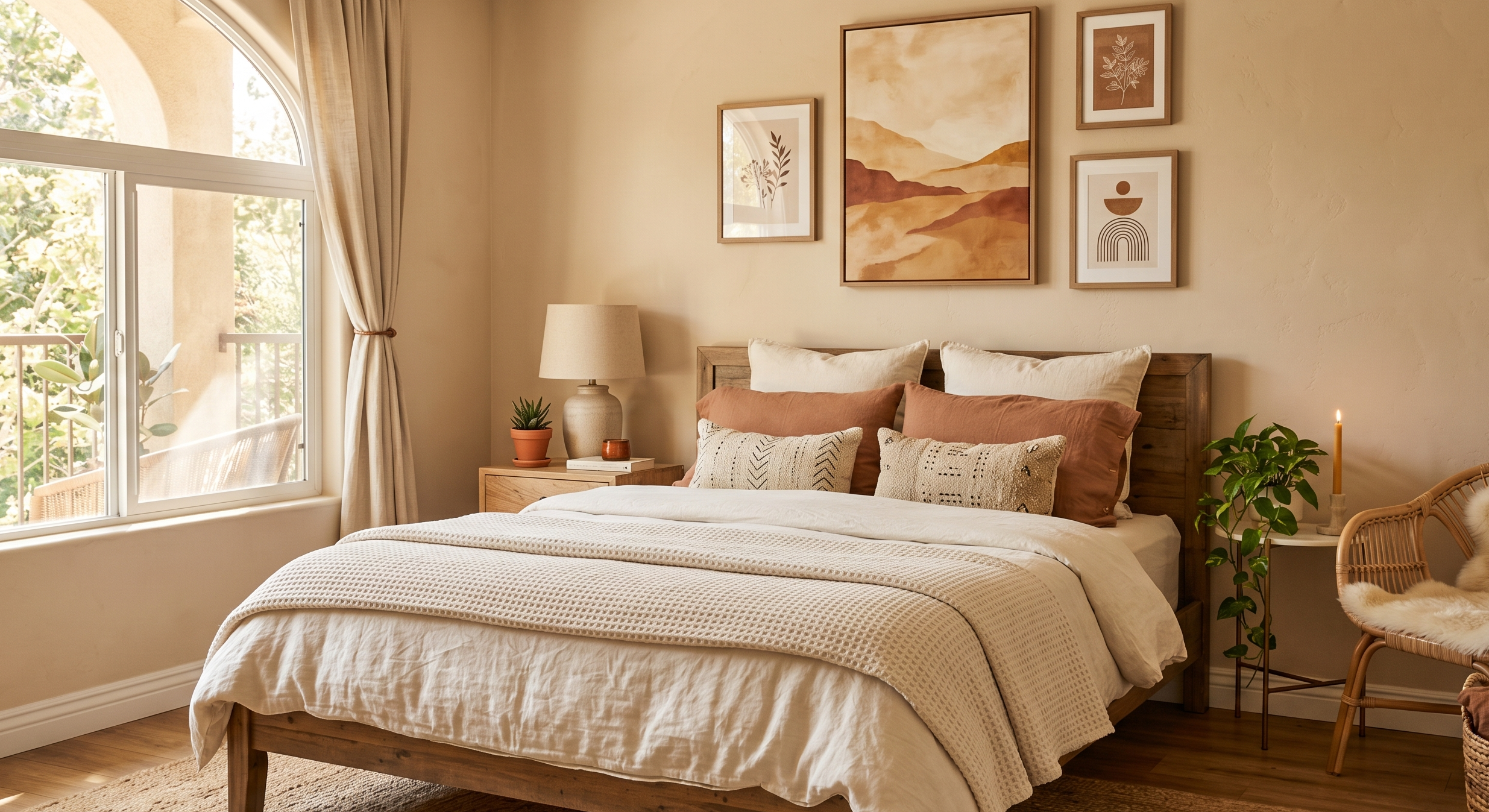
This color scheme surprised me the most.
I used to think terracotta only worked in boho spaces, but when paired with sandy neutrals, it creates this grounded warmth that feels incredibly inviting.
Especially in rooms with lots of natural sunlight.
You don’t even need to paint the walls terracotta. Sometimes just adding:
- Clay-colored pillows
- Rust-toned throws
- Warm earthy artwork
…is enough to completely shift the atmosphere.
5. Charcoal + Taupe + Soft White
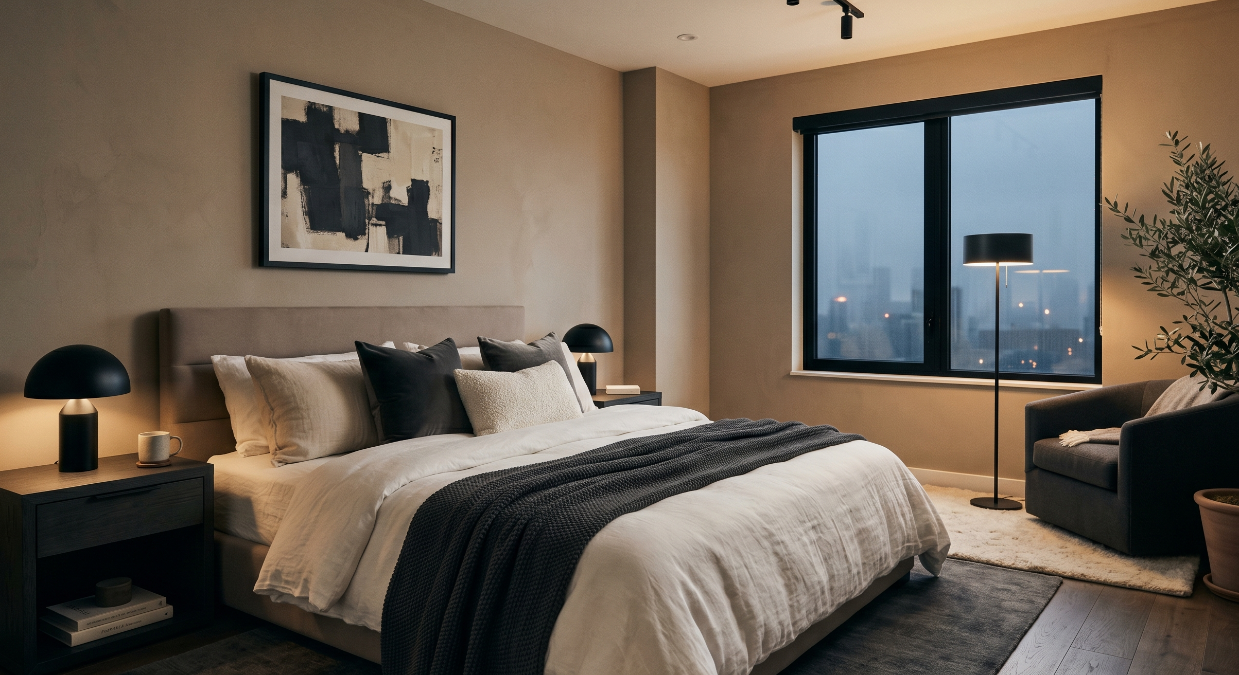
For people who want moodier bedrooms without making the space feel cave-like.
I tested charcoal accents in my own bedroom after years of avoiding dark colors, and honestly, I regret not trying it sooner.
The key is balance.
Too much charcoal feels heavy. But mixed with taupe and creamy whites? It feels dramatic in a calm, grown-up way.
This works especially well with:
- Layered bedding
- Matte black lighting
- Soft textured fabrics
- Minimal clutter
6. Lavender Gray + Warm White
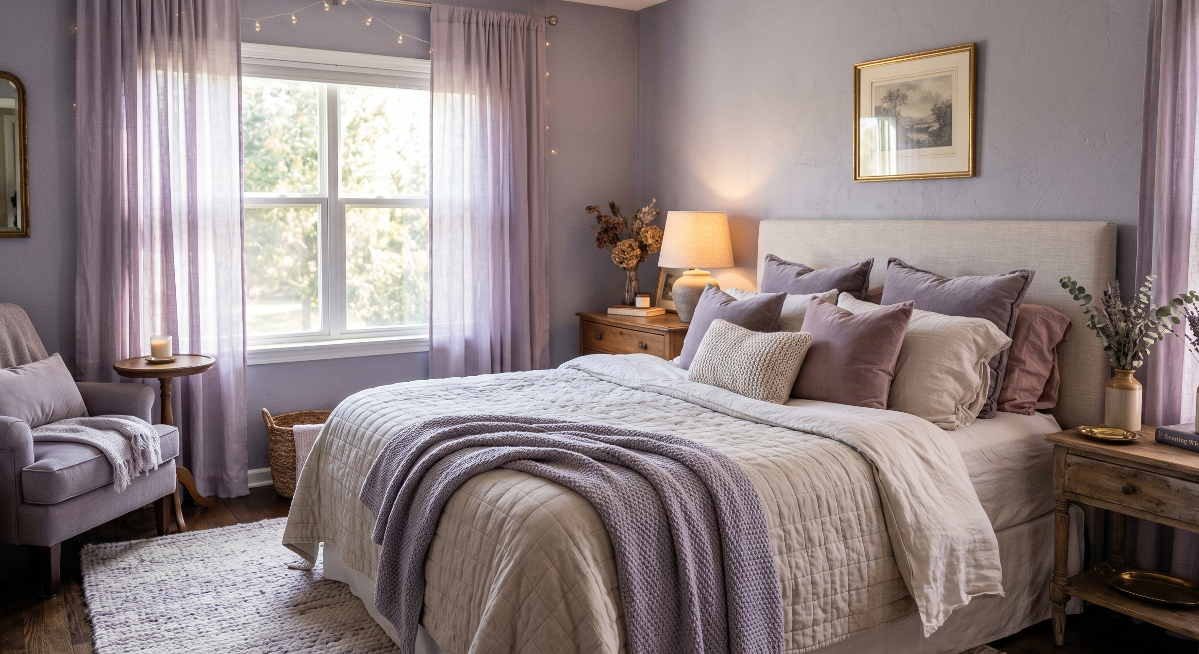
This is one of those color combinations that photographs beautifully but also feels surprisingly soothing in real life.
Not bright purple. Definitely not kid-bedroom purple.
More like soft cloudy lavender with gray undertones.
It creates a dreamy atmosphere without trying too hard.
I’ve noticed this scheme becoming huge in 2026 because people want bedrooms that feel romantic but still mature.
7. Olive Green + Walnut Brown + Cream
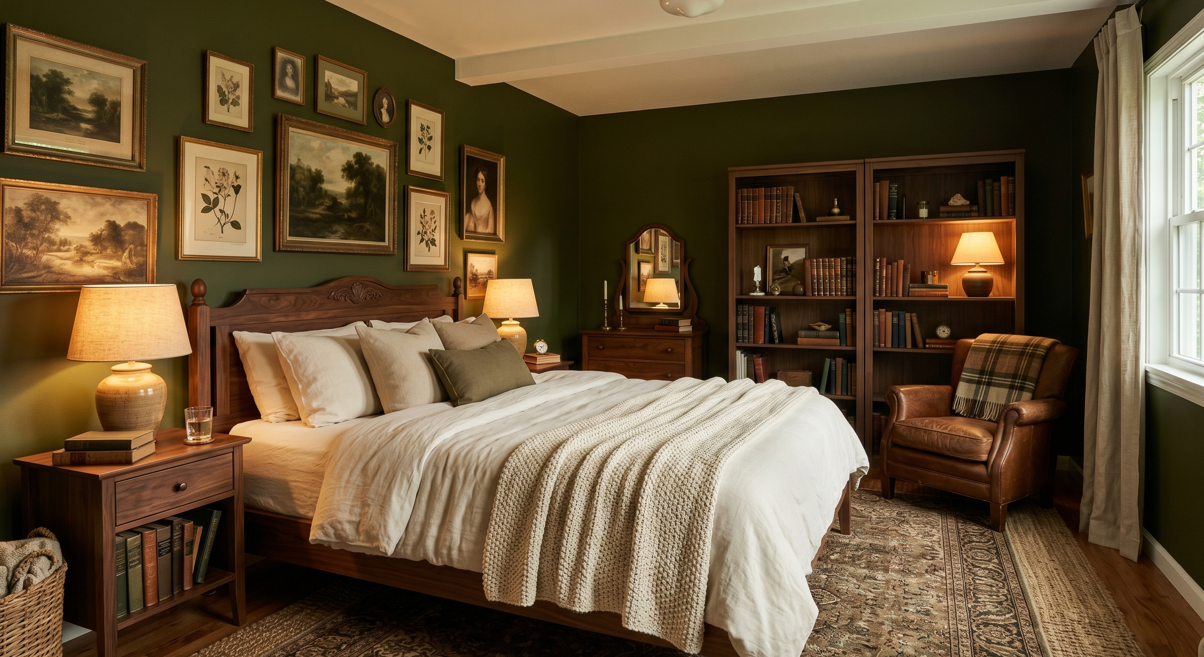
This combination feels rich and cozy at the same time.
Almost library-like, but softer.
I saw a bedroom styled this way in a tiny apartment, and somehow it made the entire space feel expensive. The walnut tones added depth while cream bedding kept everything balanced.
Best additions for this look:
- Warm table lamps
- Vintage artwork
- Woven textures
- Soft cream curtains
8. Blush Pink + Warm Beige
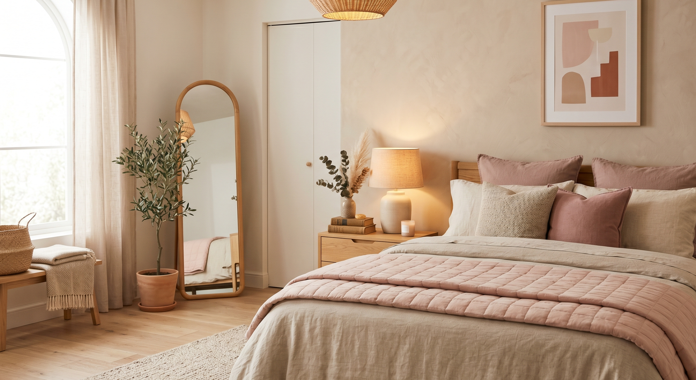
I know some people immediately hear “pink bedroom” and panic a little.
But blush pink in 2026 looks very different from older trends.
Modern blush tones are dusty, muted, and almost neutral. When paired with beige, the room feels soft and comforting rather than overly feminine.
Actually, this color scheme works beautifully for minimalist spaces too.
9. Deep Navy + Crisp White + Wood Tones
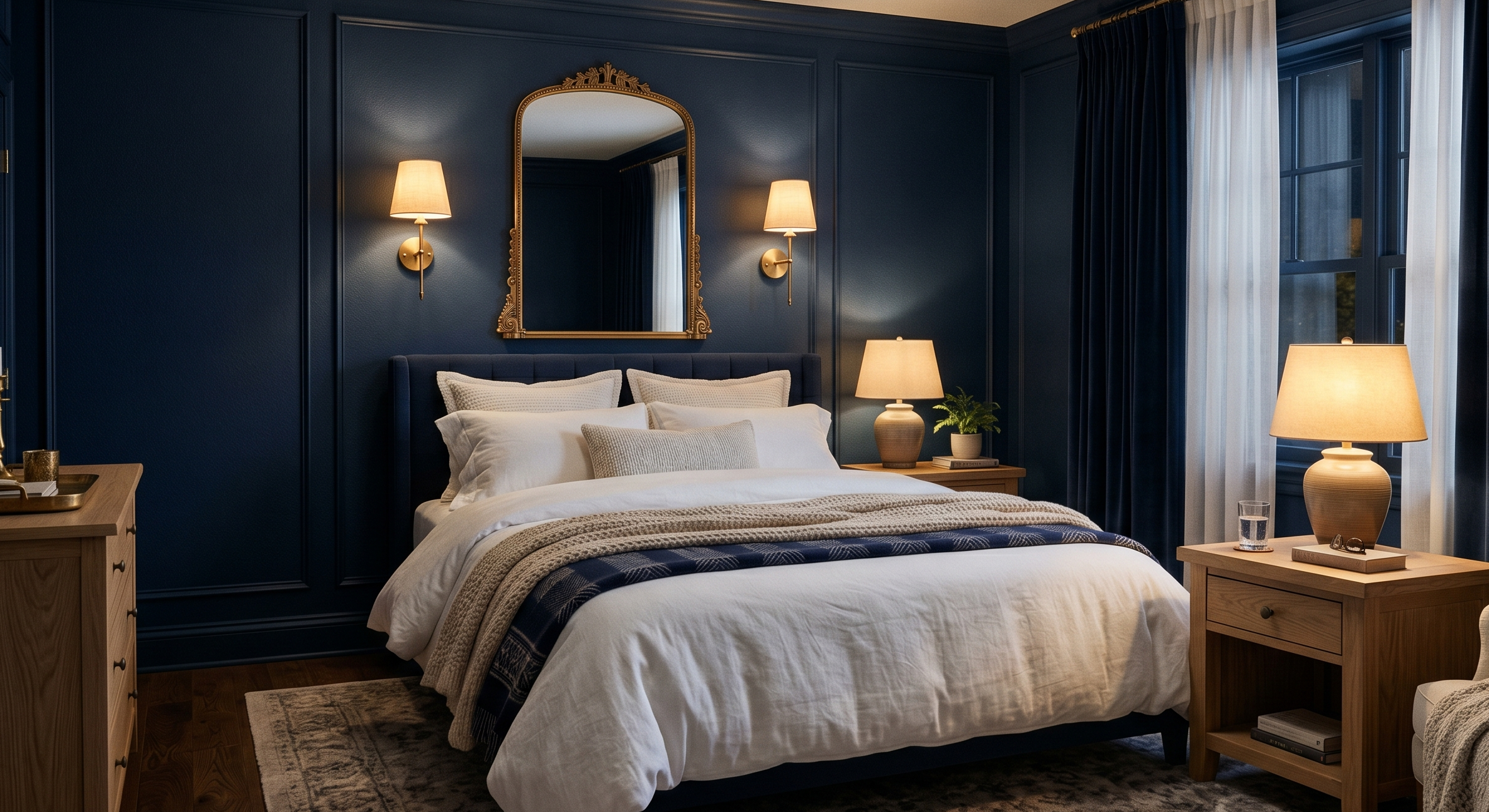
This combination always feels classic.
There’s something about navy bedrooms that feels deeply restful, especially at night.
But I learned the hard way not to overdo dark paint in smaller rooms. One accent wall usually works better unless the room gets amazing natural light.
Things that help soften navy:
- White bedding
- Light oak furniture
- Large mirrors
- Warm lamps
Without warmth, navy can start feeling too formal.
10. Greige + Soft Black + Linen White
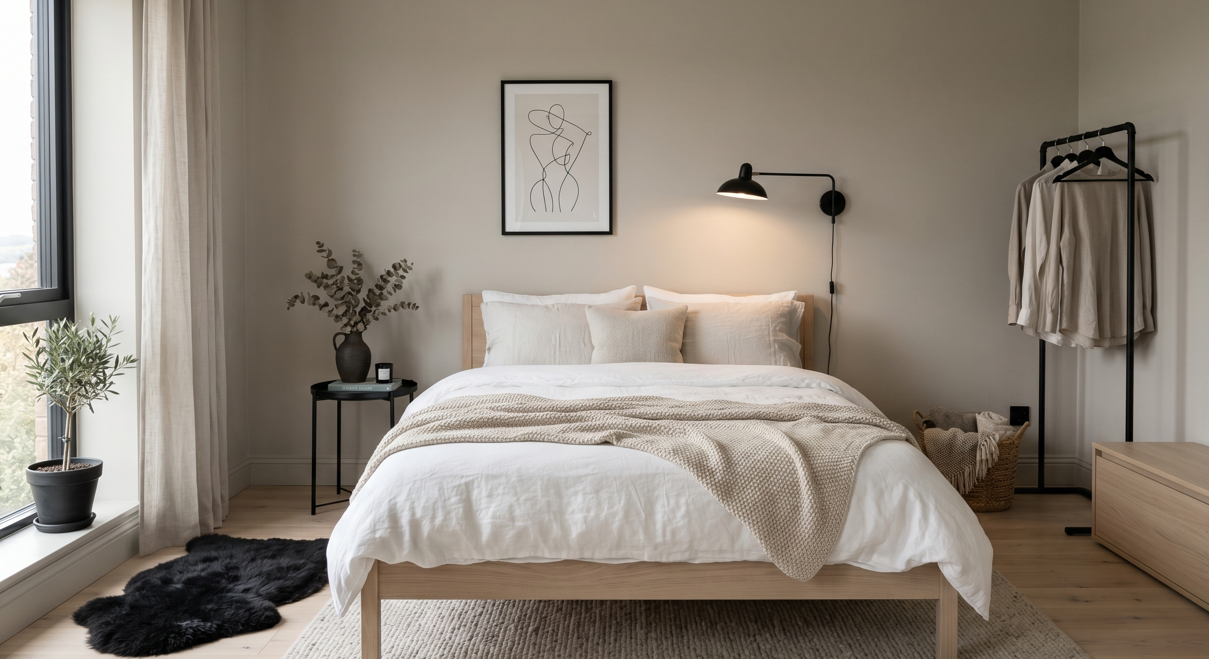
Greige still refuses to disappear, honestly.
And I understand why.
It’s one of the easiest shades to decorate around because it shifts between warm and cool depending on lighting.
This scheme works especially well if you like:
- Minimalist bedrooms
- Scandinavian decor
- Clean lines
- Calm neutral palettes
Soft black accents make the room feel more intentional without making it heavy.
Color Schemes That Make Small Bedrooms Feel Bigger
This became important to me after moving into a smaller apartment where every inch suddenly mattered.
Some color combinations genuinely make cramped rooms feel more breathable.
11. Pale Blue + White
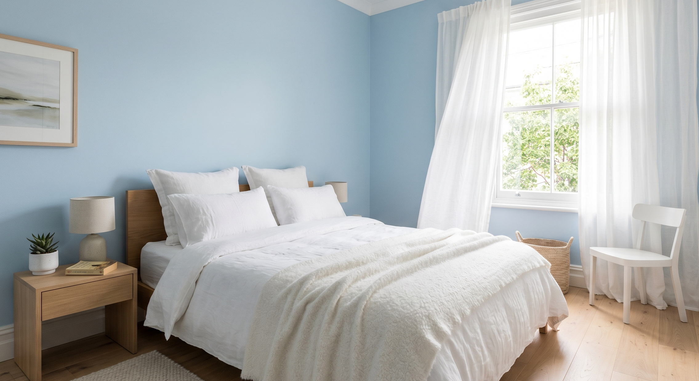
Feels airy and open.
12. Soft Mushroom + Cream
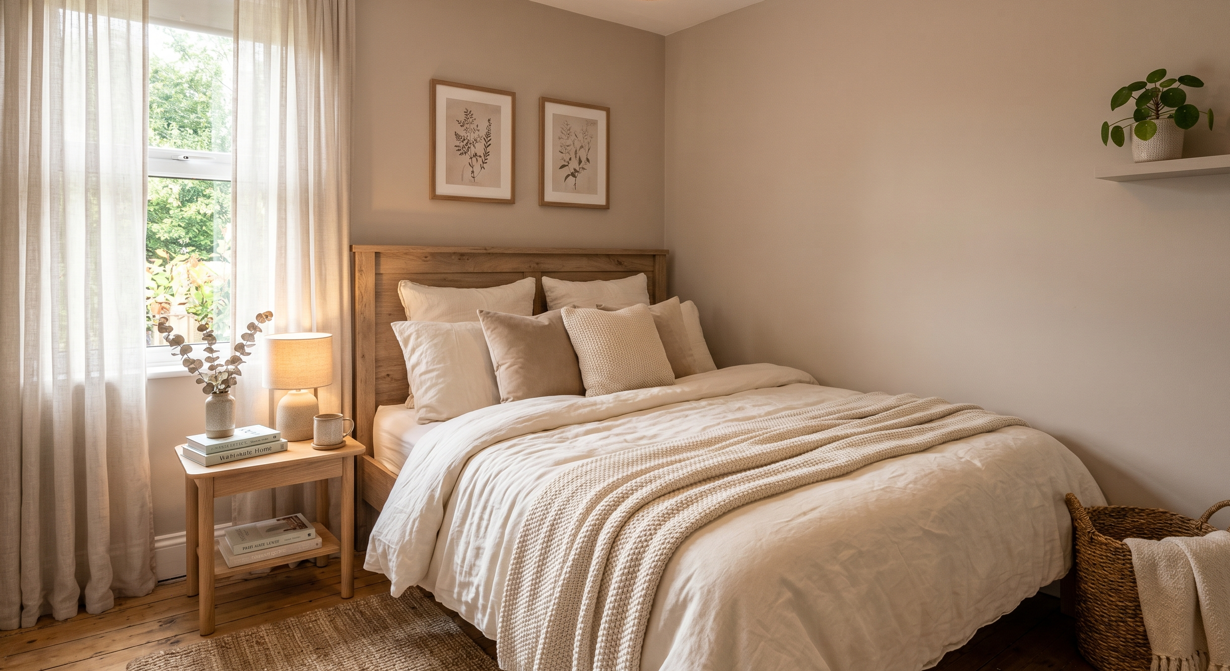
Warm without feeling dark.
13. Light Sage + Ivory
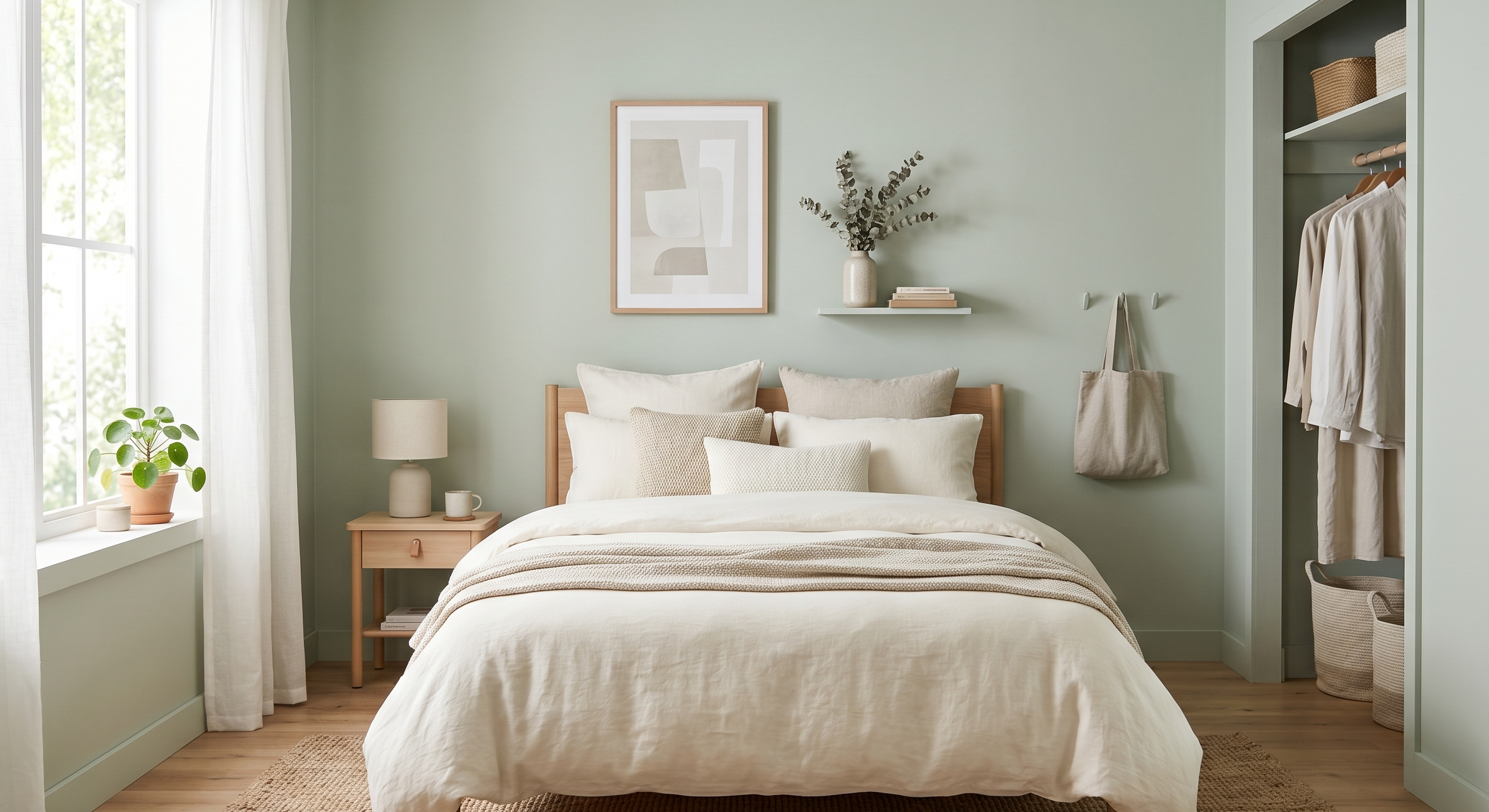
Adds color while keeping brightness.
14. Warm Taupe + Off-White
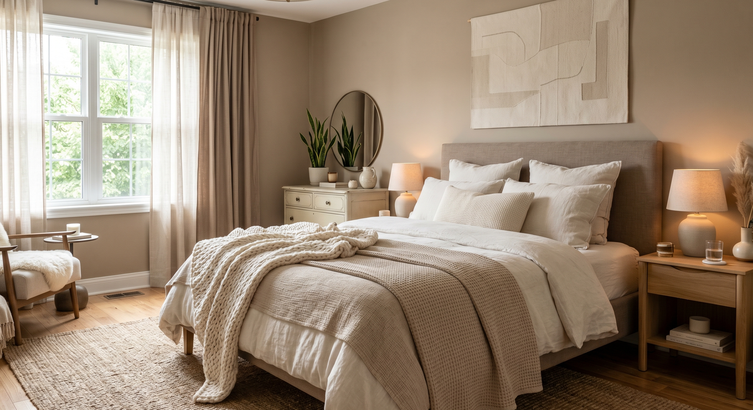
Makes walls feel softer and less boxed-in.
15. Sand + Pale Peach
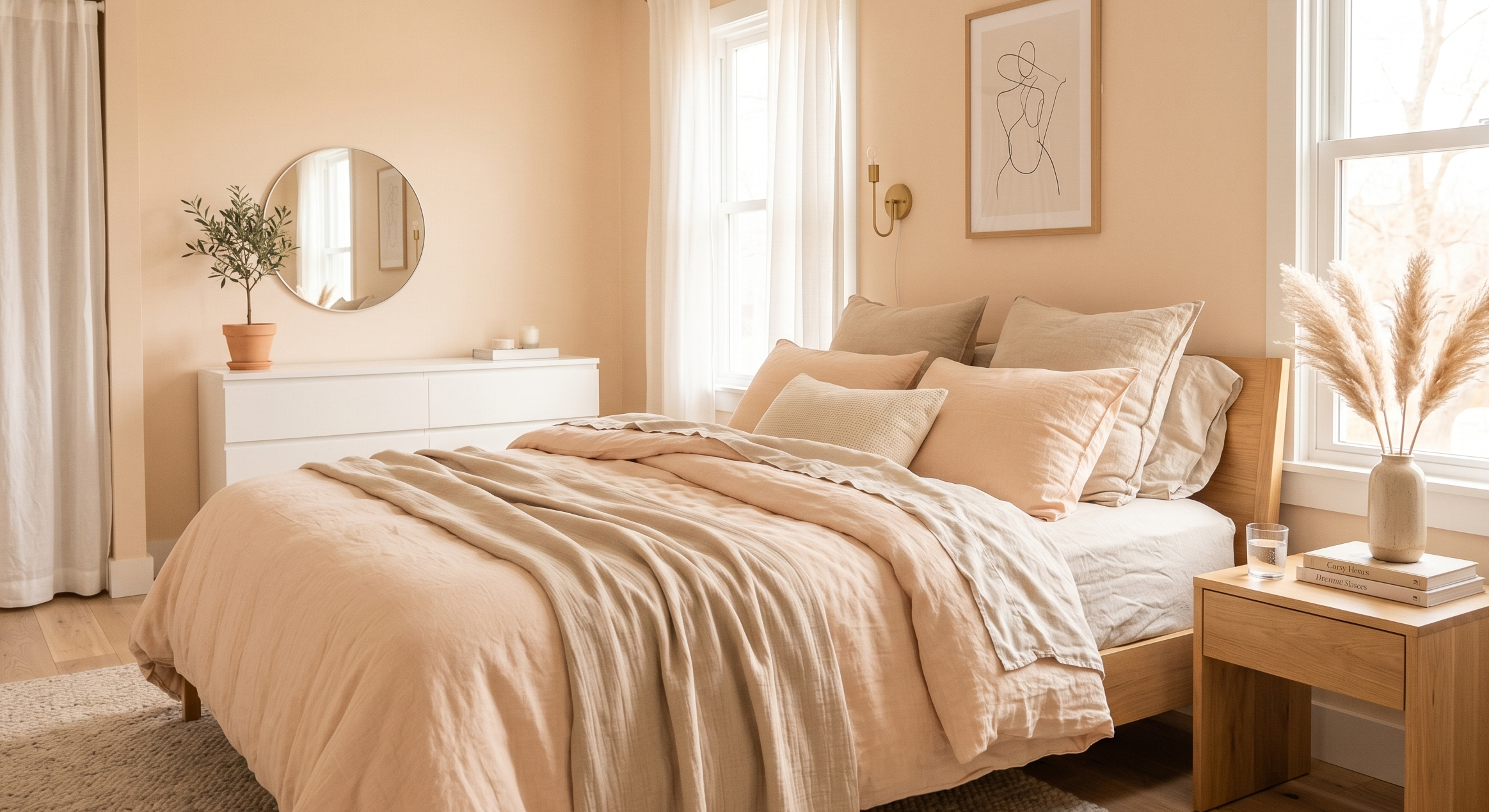
Quietly cheerful without overwhelming the room.
One thing I learned? Matching everything perfectly actually makes small rooms feel flatter. A little contrast adds depth.
Cozy Bedroom Color Schemes That Feel Like a Retreat
Honestly, after stressful days, these are the combinations I keep gravitating toward most.
16. Chocolate Brown + Cream
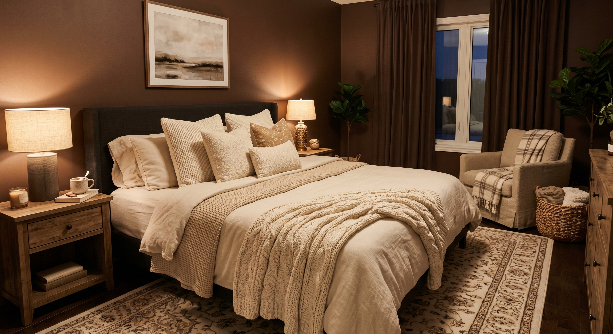
Unexpectedly cozy.
17. Forest Green + Beige
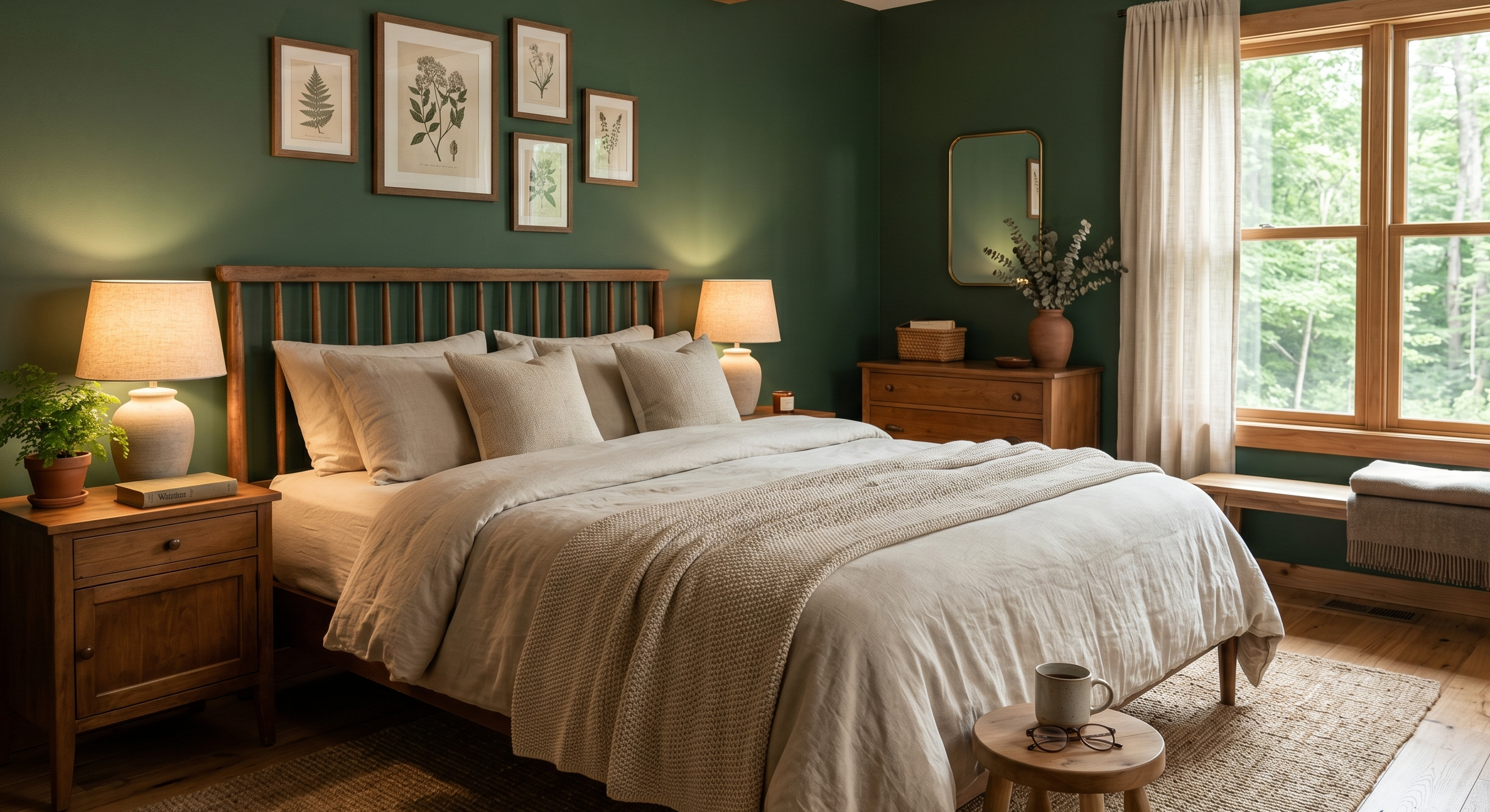
Feels grounding and peaceful.
18. Cinnamon + Warm White
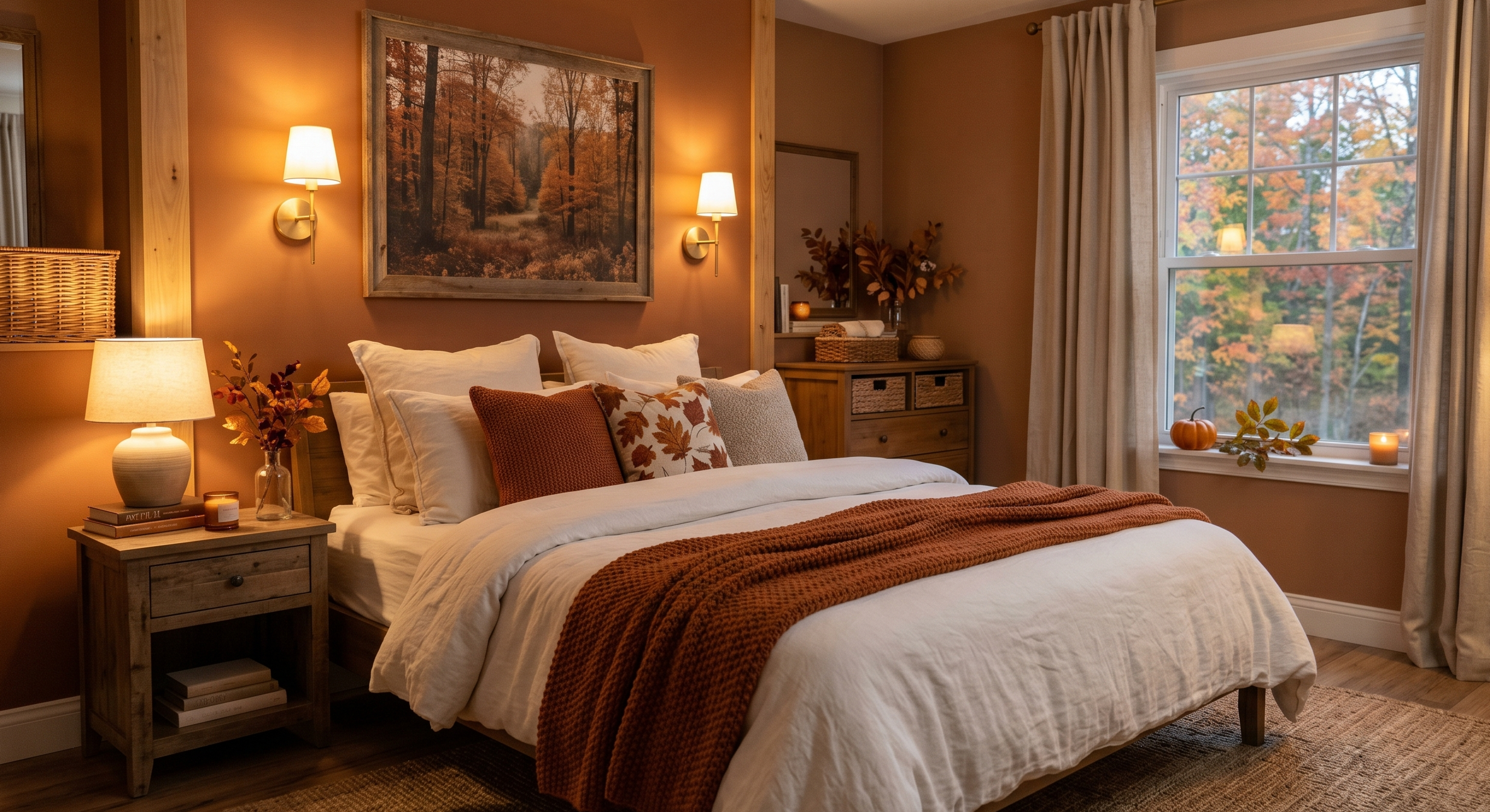
Perfect for fall-inspired bedrooms.
19. Dusty Rose + Taupe
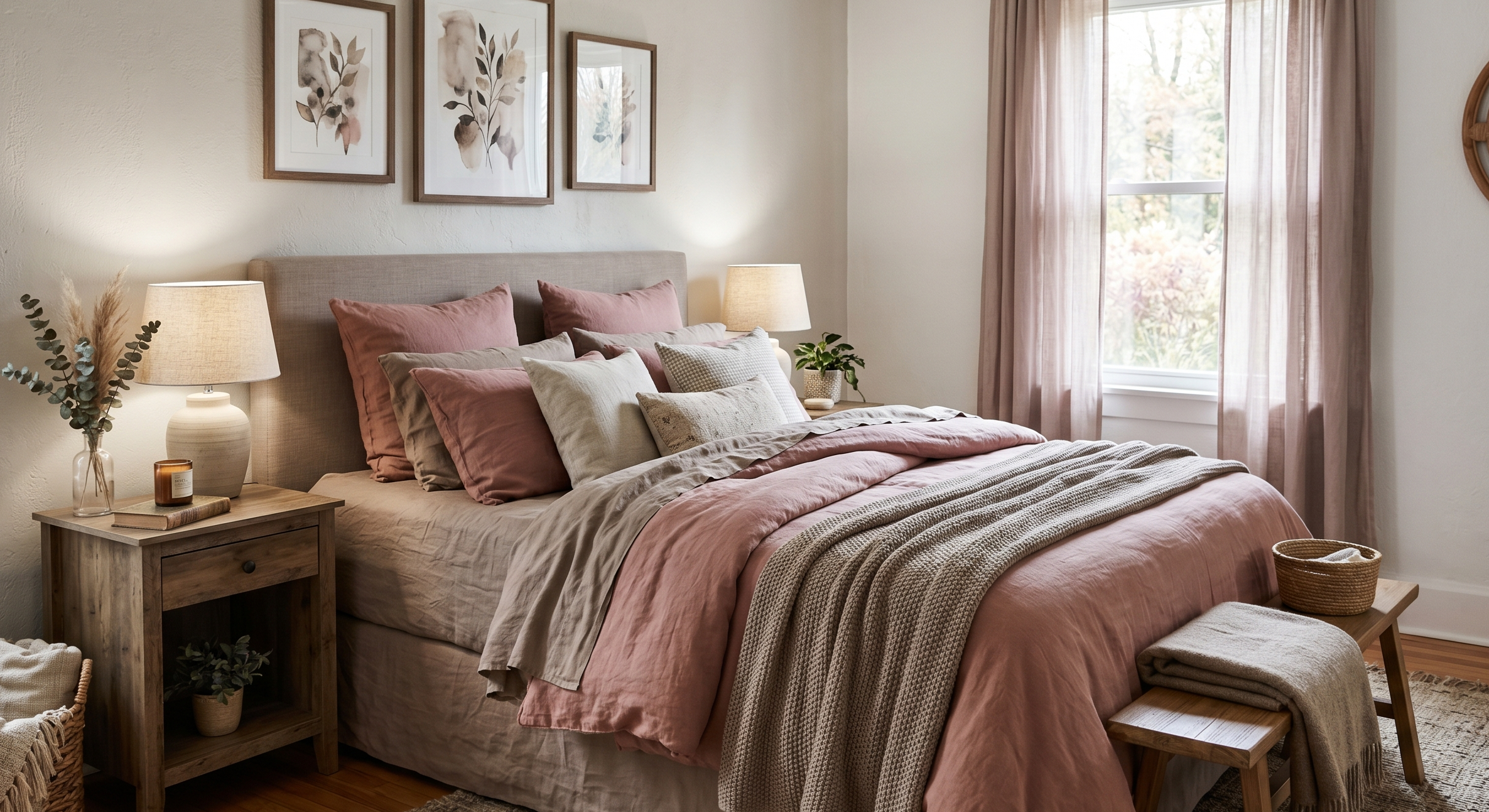
Soft and comforting without looking too sweet.
20. Slate Blue + Warm Gray
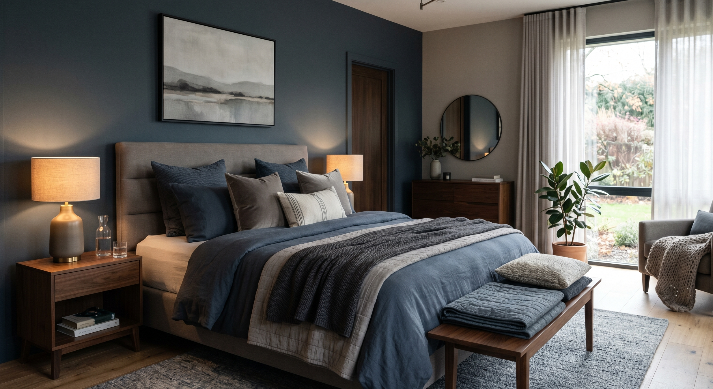
A little moody, very relaxing.
These combinations work best when paired with layered textures:
- Chunky blankets
- Linen bedding
- Warm lighting
- Soft curtains
- Rugs with subtle texture
Texture matters almost as much as colour, honestly.
Dreamy Modern Bedroom Color Schemes for 2026
A lot of modern bedroom trends right now feel less cold than they used to. People still want clean spaces, but they also want warmth and personality.
21. Clay Beige + Black Accents
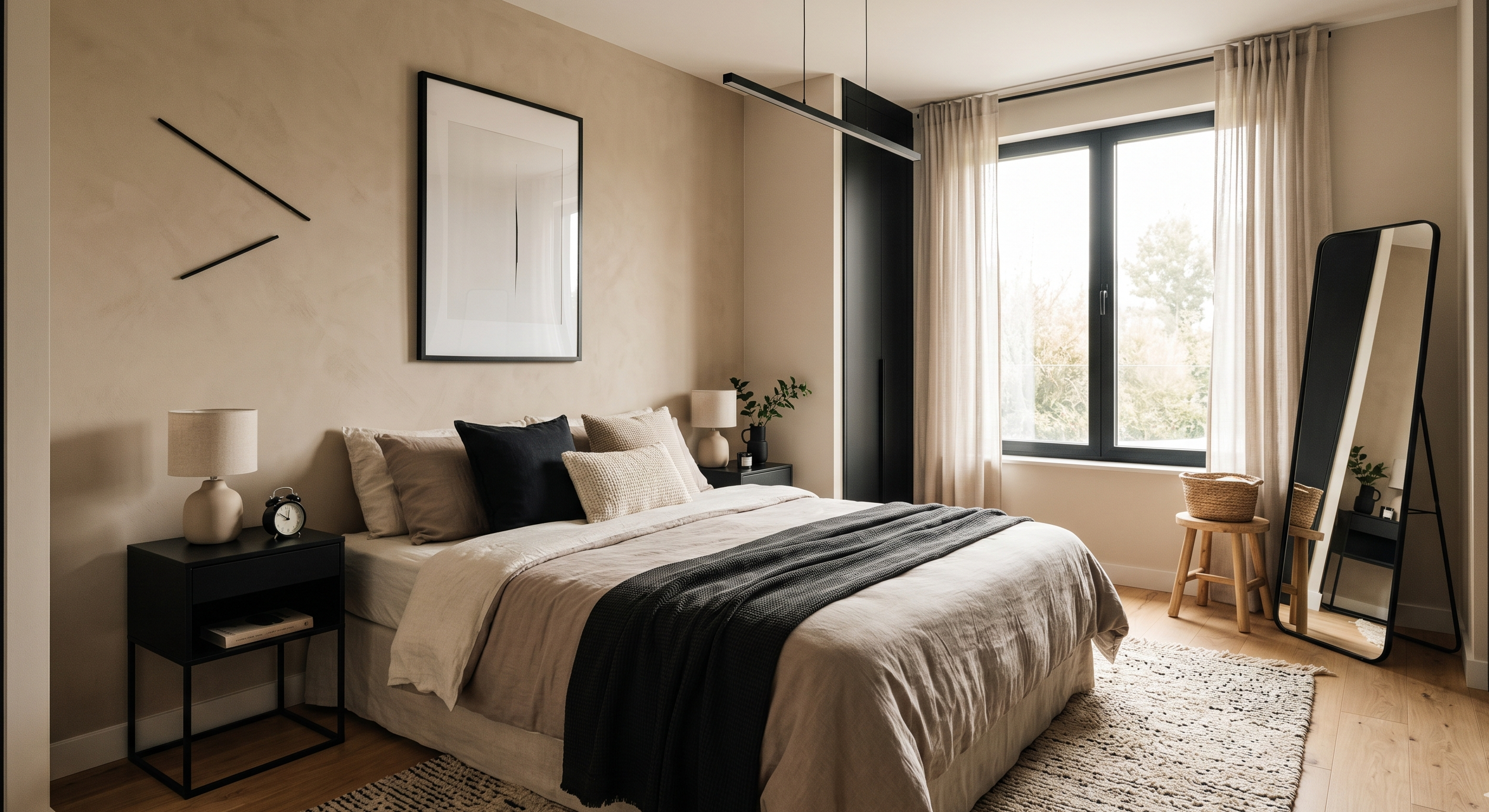
Minimal but warm.
22. Muted Teal + Walnut
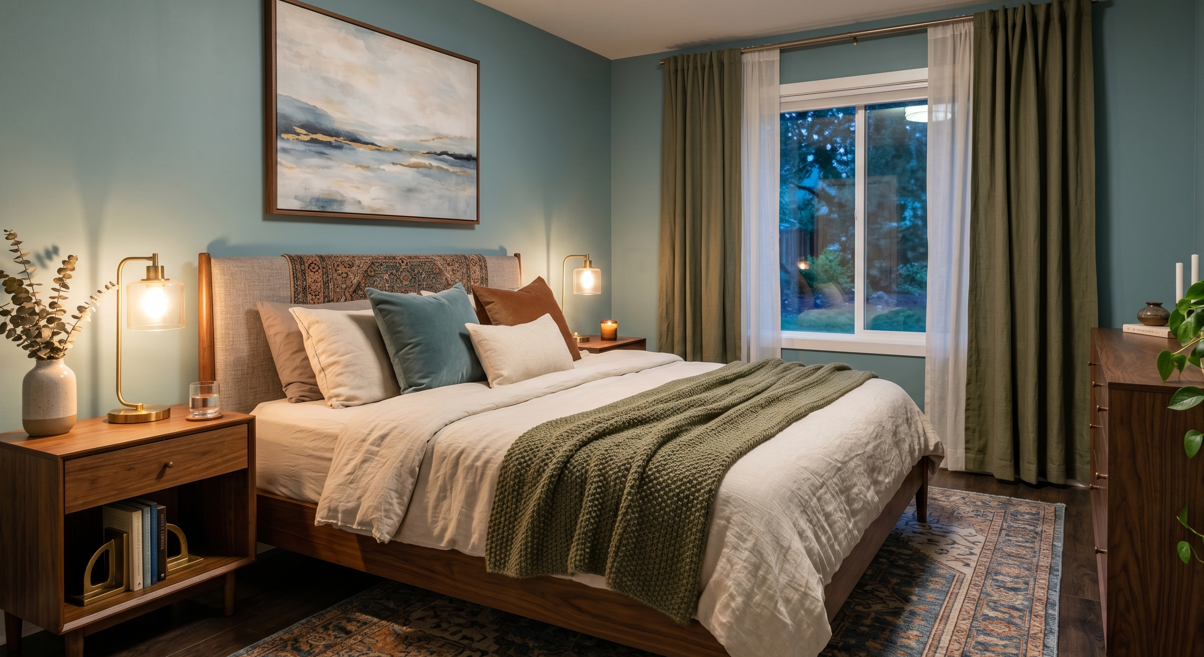
Adds depth without overpowering the room.
23. Buttercream Yellow + Cream
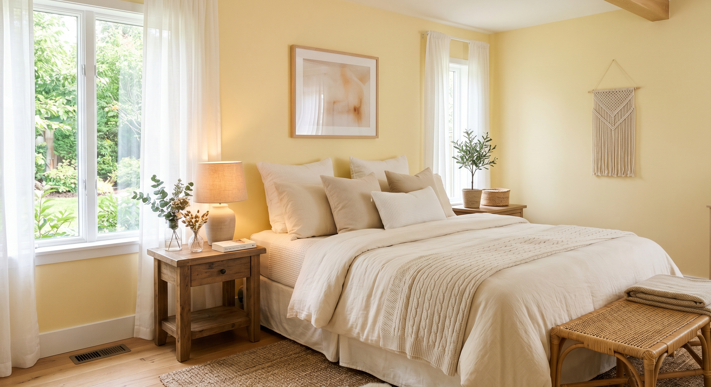
This one surprised me. It feels cheerful in a very soft way.
24. Smoky Plum + Beige
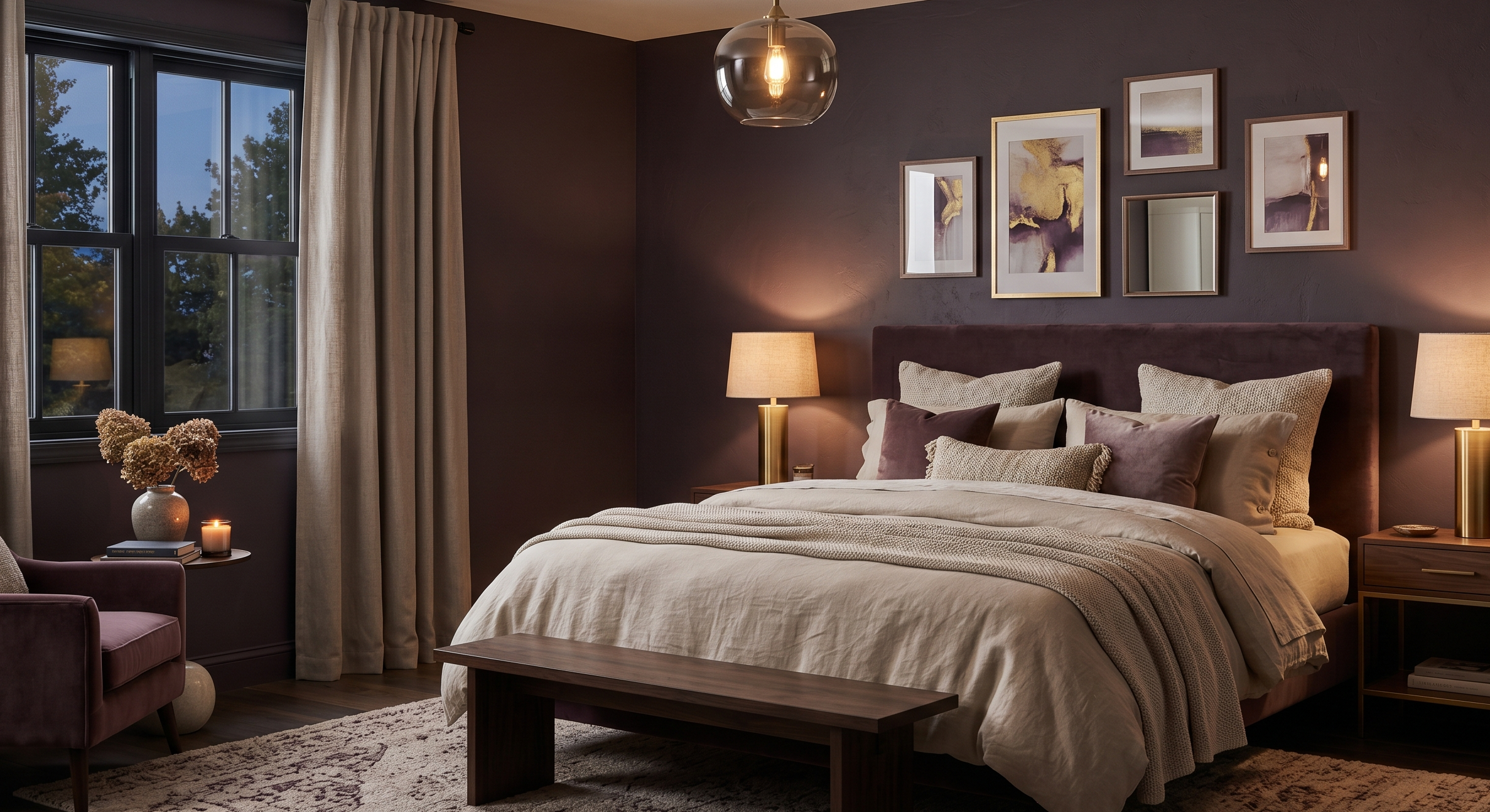
Quietly dramatic.
25. Soft Mocha + Ivory
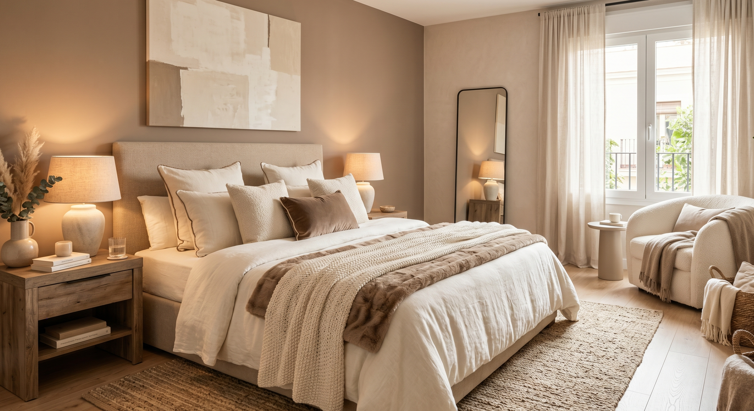
Probably one of the safest and prettiest combinations right now.
It works in almost every type of bedroom:
- Small apartments
- Guest rooms
- Modern homes
- Cozy cottages
- Minimalist spaces
And it ages well, which matters more than people think.
A Few Things I Wish I Knew Before Choosing Bedroom Colors
After repainting rooms more times than I’d like to admit, these are the biggest lessons I learned:
Lighting changes everything
Seriously. A color that looks warm online might look icy in your room.
Always test samples first.
Bedding affects the entire palette
I used to focus only on wall paint, but bedding often becomes the biggest visual element in the room.
Warm tones usually feel cozier
Especially in bedrooms.
Even cool-toned rooms benefit from warm wood, warm lighting, or soft beige accents.
Don’t rush trends
If you genuinely love a color, you’ll probably enjoy it longer than whatever trend is dominating social media that month.
Final Thoughts
I think what makes a bedroom feel dreamy in 2026 isn’t perfection anymore.
It’s comfort.
The rooms people seem most drawn to now aren’t overly staged or ultra-modern in a cold way. They feel personal. Calm. Slightly layered. A little imperfect sometimes.
And honestly, that’s probably why these room color schemes bedroom lovers keep saving over and over again. They create spaces that feel emotionally warm — not just visually pretty.
If I could give one piece of advice after obsessing over paint swatches for way too long, it would be this:
Choose colors that make you exhale when you walk into the room.
That feeling matters more than trends ever will.