I still remember the moment I realized color mattered more than furniture.
A few years ago, I spent way too much money trying to make my living room feel “high-end.” I bought a trendy coffee table, swapped out lighting, added decorative pillows I didn’t even like that much… and somehow the room still felt flat. It looked unfinished. Kind of random.
Then one weekend, almost out of frustration, I repainted the walls.
That changed everything.
The room suddenly felt calmer, cleaner, and honestly more expensive — even though I hadn’t changed most of the furniture at all. Since then, I’ve become slightly obsessed with room color schemes and how much they shape the feeling of a space. Some colors make a room feel cluttered without you realizing it. Others quietly make everything look elevated.
And the good news is, you don’t need a massive renovation budget to pull this off.
These are the modern room color schemes I keep coming back to whenever I want a home to feel warm, stylish, and a little luxurious without trying too hard.
1. Warm White + Beige + Soft Black

This combination feels timeless in the best way.
I used this palette in a small guest bedroom once, and it instantly made the space feel more intentional. The warm white walls kept everything bright, while beige textiles softened the room. Adding tiny black accents — like lamp bases or curtain rods — gave it contrast without making it feel harsh.
What works well:
- Cream or ivory walls
- Beige bedding or rugs
- Matte black frames or lighting
- Natural wood furniture
It’s simple, but it never feels boring.
2. Sage Green + Warm Oak + Cream
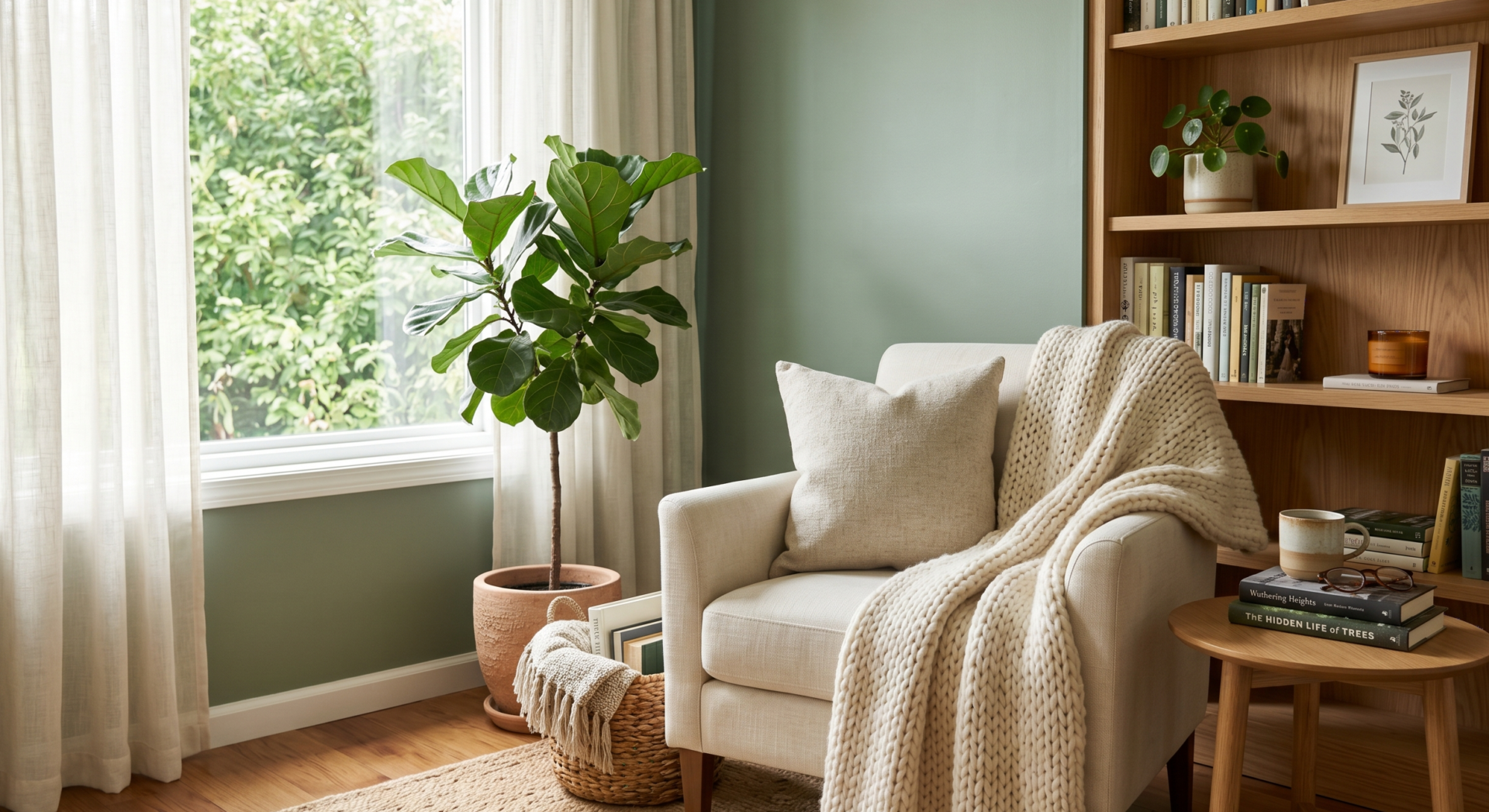
There’s something incredibly calming about sage green. Every time I see it in a room, the space feels relaxed but still polished.
I once painted a reading corner sage green almost on impulse, and somehow the entire room started looking more curated afterward. It pairs beautifully with oak wood tones and soft cream fabrics.
This works especially well in:
- Bedrooms
- Home offices
- Cozy living rooms
The trick is keeping the green muted instead of overly bright.
3. Charcoal Gray + Camel + White

This one feels very modern-city-apartment to me.
Dark charcoal walls or furniture can sometimes feel intimidating, but when paired with camel leather and crisp white accents, the whole room suddenly feels designer-inspired.
I personally love this for masculine spaces or modern living rooms.
A few ideas:
- Charcoal sectional sofa
- Camel leather chair
- White curtains
- Black-and-white photography
The contrast makes everything feel intentional.
4. Greige + Taupe + Soft White

Greige became popular for a reason. It’s one of those colors that quietly makes everything look expensive.
Not gray. Not beige. Somewhere perfectly in between.
I used greige in a hallway once because I couldn’t decide between warm or cool tones, and weirdly enough, it worked with literally everything.
This palette is ideal if you:
- Change decor often
- Want flexibility
- Prefer soft, calming interiors
It creates that clean Pinterest-style look without feeling cold.
5. Navy Blue + Brass + Cream

I used to think navy walls would make a room feel smaller. Turns out, when done correctly, they can actually make a space feel richer and more dramatic.
Especially with brass lighting.
One of my favorite combinations ever is deep navy walls with cream curtains and warm metallic accents. At night, under warm lighting, it looks incredibly cozy.
Best places to try this:
- Dining rooms
- Offices
- Accent walls
- Powder rooms
A little navy goes a long way.
6. Dusty Rose + Warm White + Walnut
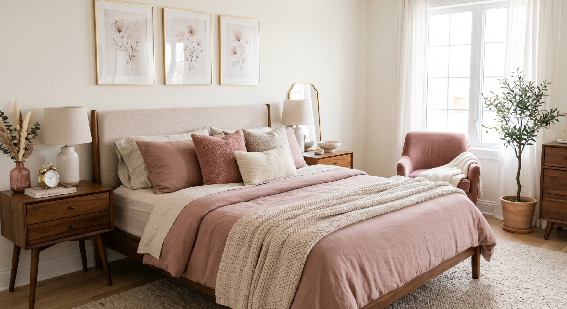
This color scheme surprised me.
I originally thought dusty rose would feel too feminine or trendy, but paired with walnut wood tones, it actually feels elegant and mature.
The important thing is choosing muted pinks instead of bubblegum shades.
I’ve seen this work beautifully with:
- Walnut nightstands
- Linen bedding
- Soft gold decor
- Neutral rugs
It gives a room warmth without overwhelming it.
7. Olive Green + Black + Natural Linen

This palette feels grounded and earthy.
I love olive green because it adds depth without screaming for attention. When paired with black accents and natural linen textures, the whole room feels relaxed but expensive in that quiet boutique-hotel kind of way.
A few things that help:
- Linen curtains
- Woven baskets
- Olive-painted cabinetry
- Matte black hardware
Honestly, even small touches in these colors can transform a plain room.
8. Soft Terracotta + Cream + Sand
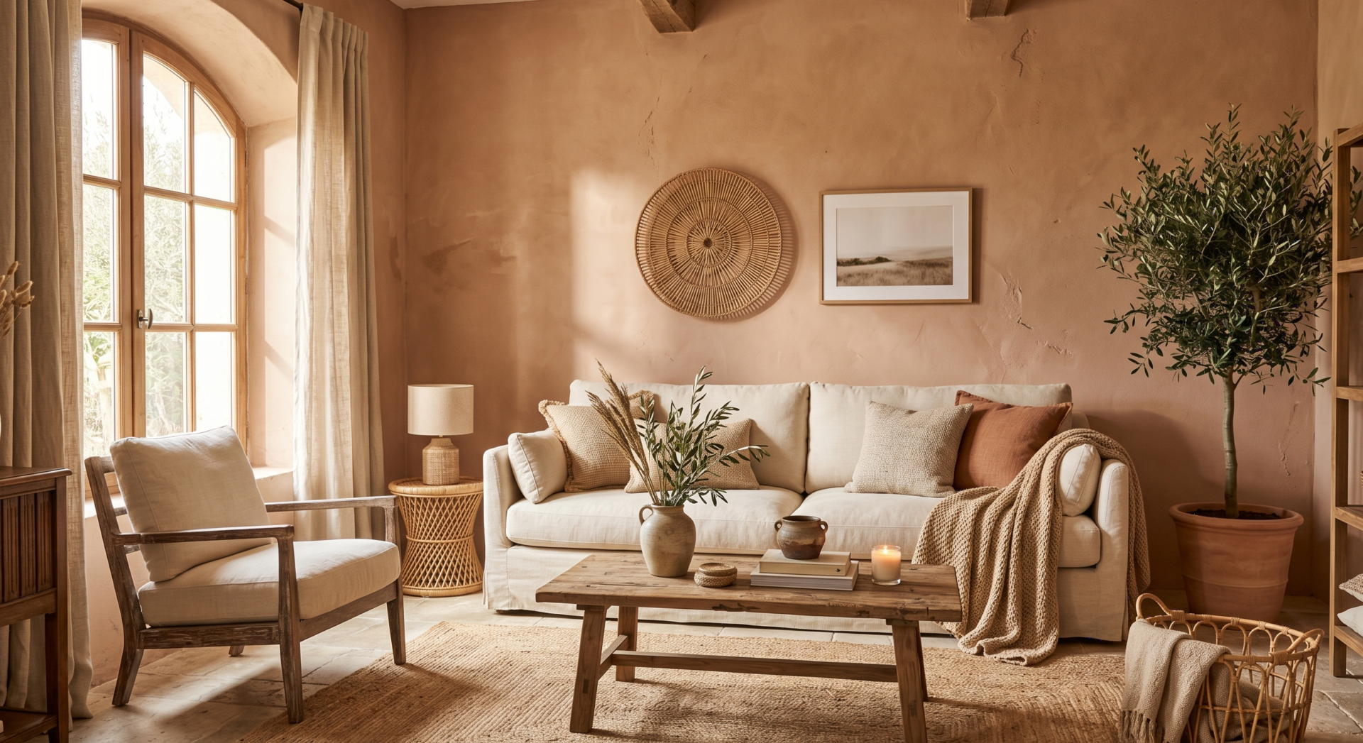
I started noticing this palette everywhere after traveling through a few Mediterranean-inspired interiors online. It feels warm, sunlit, and welcoming.
Terracotta works especially well when it’s muted and clay-like rather than orange.
This color scheme pairs beautifully with:
- Textured plaster walls
- Rattan decor
- Sandy beige upholstery
- Warm wood
It makes a room feel lived-in in the best possible way.
9. Black + White + Warm Wood

Classic for a reason.
I know black-and-white interiors sometimes get criticized for feeling too stark, but adding warm wood completely changes the mood.
I tried this in a tiny apartment kitchen years ago:
- White cabinets
- Black handles
- Oak floating shelves
That little space looked far more expensive afterward, and honestly, it was mostly paint and hardware.
10. Mocha Brown + Cream + Soft Gold

Brown is making a huge comeback, and personally, I’m glad.
Not the heavy dark brown from older homes — more like soft mocha or cocoa tones that feel warm and comforting.
This palette works beautifully in bedrooms because it creates a cozy atmosphere without feeling dark.
I especially love:
- Mocha bedding
- Cream walls
- Gold-framed mirrors
- Soft layered lighting
The room feels instantly more luxurious.
11. Pale Blue + White + Light Gray
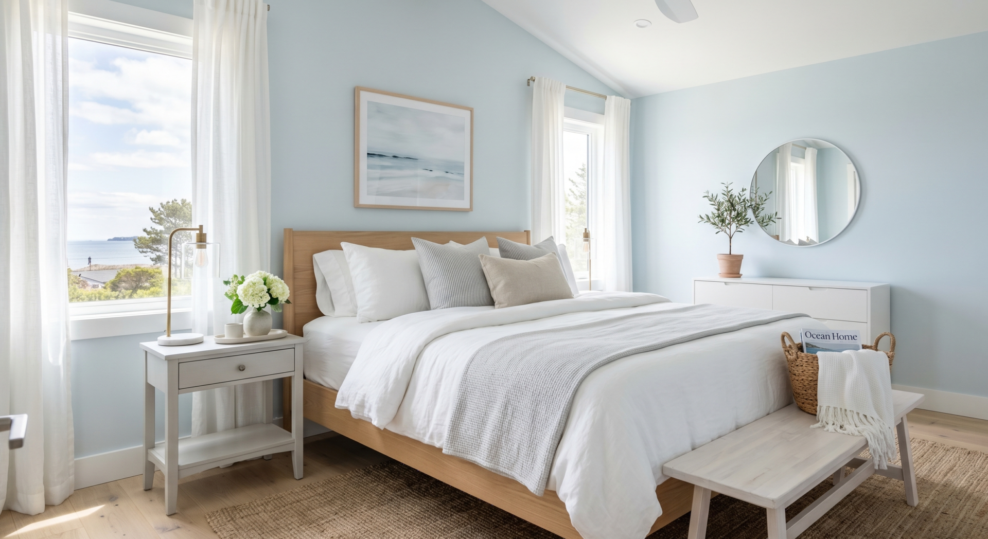
If you want something airy and peaceful, this combination works every single time.
It reminds me of coastal homes without going fully nautical.
One thing I learned the hard way: pale blue works best when the undertones stay soft and slightly gray instead of bright aqua.
This scheme fits perfectly in:
- Bathrooms
- Guest rooms
- Small apartments
It reflects light beautifully.
12. Deep Green + Walnut + Brass

This is probably one of the richest-looking color combinations on this list.
Deep green walls paired with walnut furniture create instant depth. Add brass sconces or handles, and suddenly the room feels custom-designed.
I saw this once in a tiny apartment dining nook, and it honestly looked like something from an interior magazine.
Moodier colors can work incredibly well when balanced with warm materials.
13. Cream + Caramel + Textured White

This palette relies more on texture than contrast.
And honestly? That’s often what makes expensive homes feel expensive.
Instead of using lots of bold colors, focus on layering:
- Bouclé fabric
- Knit throws
- Textured rugs
- Linen curtains
- Ceramic decor
When the tones stay cohesive, the room feels calm and elevated.
14. Lavender Gray + White + Light Oak

I know lavender sounds risky, but muted lavender-gray tones can actually feel sophisticated.
Very subtle. Almost barely there.
I’ve seen this used beautifully in bedrooms where the goal is softness without becoming overly pastel.
Pair it with:
- White bedding
- Light oak furniture
- Warm lighting
The result feels surprisingly modern.
15. Espresso Brown + Beige + Ivory

This palette feels rich and grounded.
Espresso tones work especially well in rooms with good natural light because they add depth without making the space gloomy.
One thing I noticed when trying darker woods: keeping the walls light balances everything out immediately.
This works wonderfully in:
- Dining rooms
- Libraries
- Cozy bedrooms
16. Muted Peach + Cream + Warm Wood

Muted peach tones can make a room glow.
Not bright peach — more like faded clay or blush undertones.
I once added muted peach throw pillows to a neutral room and was shocked by how much warmer and more inviting the space suddenly felt.
It’s subtle but incredibly effective.
17. Slate Blue + White + Black

This palette feels clean and modern without looking sterile.
Slate blue adds just enough personality while still remaining neutral enough to decorate around.
I especially love this combination for:
- Modern apartments
- Home offices
- Minimalist bedrooms
Adding black accents sharpens the whole look.
18. Soft Gray + Warm Beige + Wood Tones

This is one of the safest palettes if you’re nervous about committing to stronger colors.
And honestly, safe isn’t always bad.
Sometimes the most expensive-looking homes are the ones that feel calm and cohesive instead of trendy.
A few easy upgrades:
- Replace cool gray with warmer gray tones
- Add oak or walnut accents
- Use layered lighting instead of harsh white bulbs
Lighting changes everything with this palette.
19. Forest Green + Cream + Leather

This combination feels cozy in a very grown-up way.
Forest green walls with cream upholstery and cognac leather accents create depth without needing tons of decor.
I personally love this palette during colder months because it makes spaces feel warm and cocoon-like.
20. Sand Beige + White + Black Accents
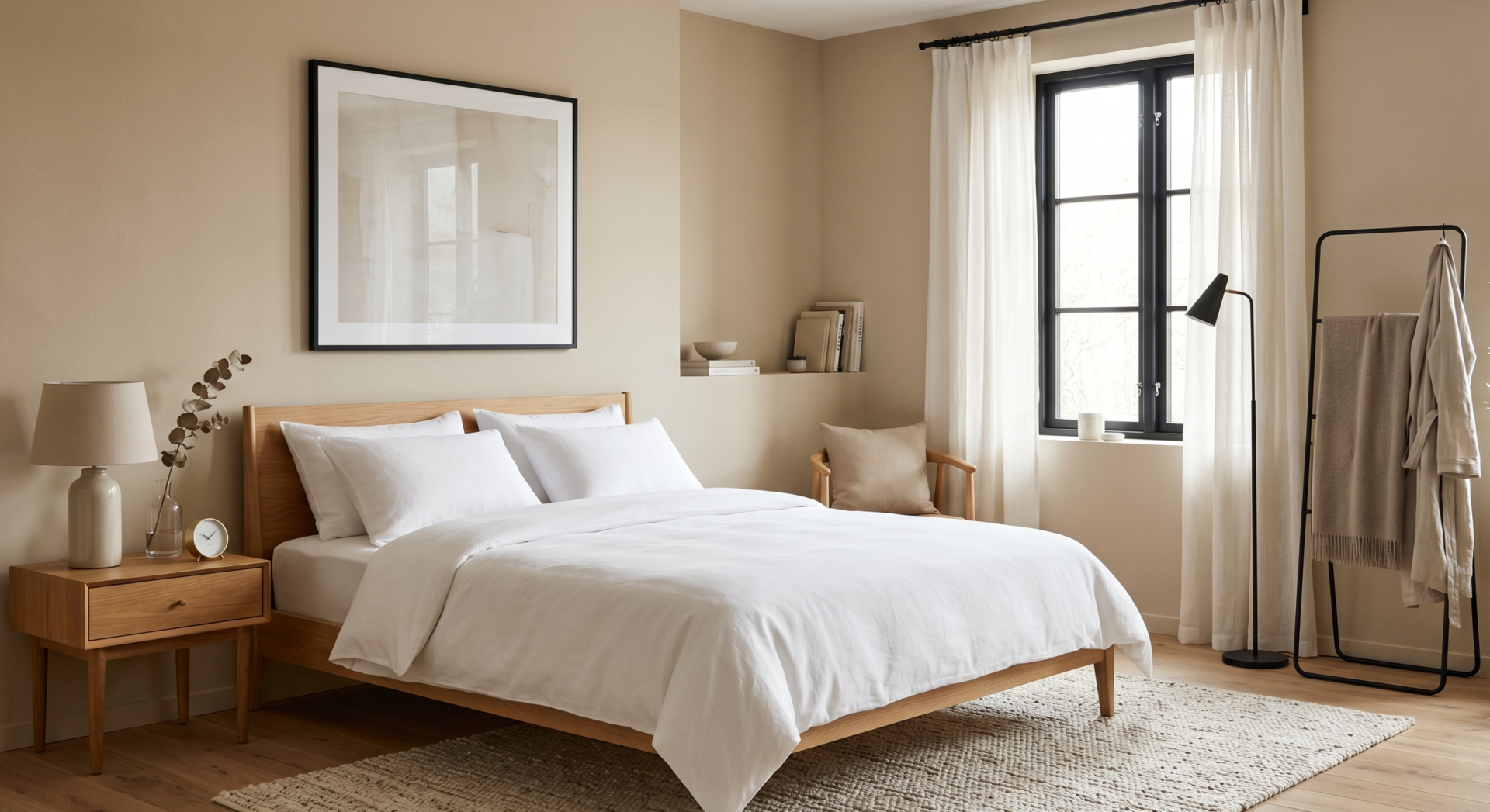
Simple, modern, and surprisingly luxurious.
This is one of those palettes that works almost anywhere because the contrast stays balanced.
Some small details that help:
- Black curtain rods
- White bedding
- Sand-colored walls
- Minimal clutter
The cleaner the room, the more expensive this palette tends to feel.
21. Taupe + Olive + Warm Cream

This final palette might actually be my favorite lately.
Taupe and olive together create a soft earthy mood that feels modern but comfortable. Add warm cream textiles, and the room immediately feels layered and welcoming.
It doesn’t scream for attention. It just quietly feels good to be in.
And honestly, I think that’s what the best interiors do.
A Few Things I Learned About Expensive-Looking Rooms
Over time, I realized expensive-looking spaces usually have a few things in common — and it’s not necessarily expensive furniture.
They stick to a consistent palette
Too many competing colors can make even beautiful furniture feel chaotic.
They use warm lighting
This one matters more than people think. Soft warm bulbs instantly make colors feel richer.
They layer texture
Linen, wood, woven materials, ceramics, velvet — texture creates depth.
They avoid overcrowding
Sometimes removing things improves a room more than adding new decor.
I’ve definitely made the mistake of overdecorating before. The room always looked better after editing things down a little.
Final Thoughts
If there’s one thing I’ve learned from constantly rearranging rooms, repainting walls, and spending far too much time saving home inspiration photos, it’s this:
Color completely changes how a home feels.
You don’t need a massive renovation budget or perfectly styled designer furniture to make your space feel beautiful. Sometimes the right room color scheme alone can make an ordinary room suddenly feel calm, intentional, and surprisingly luxurious.
And honestly, the best spaces usually aren’t the most expensive ones anyway. They’re the rooms that feel warm, personal, and comfortable the second you walk into them.
That’s always the goal for me now. Not perfection. Just spaces that genuinely feel good to live in.