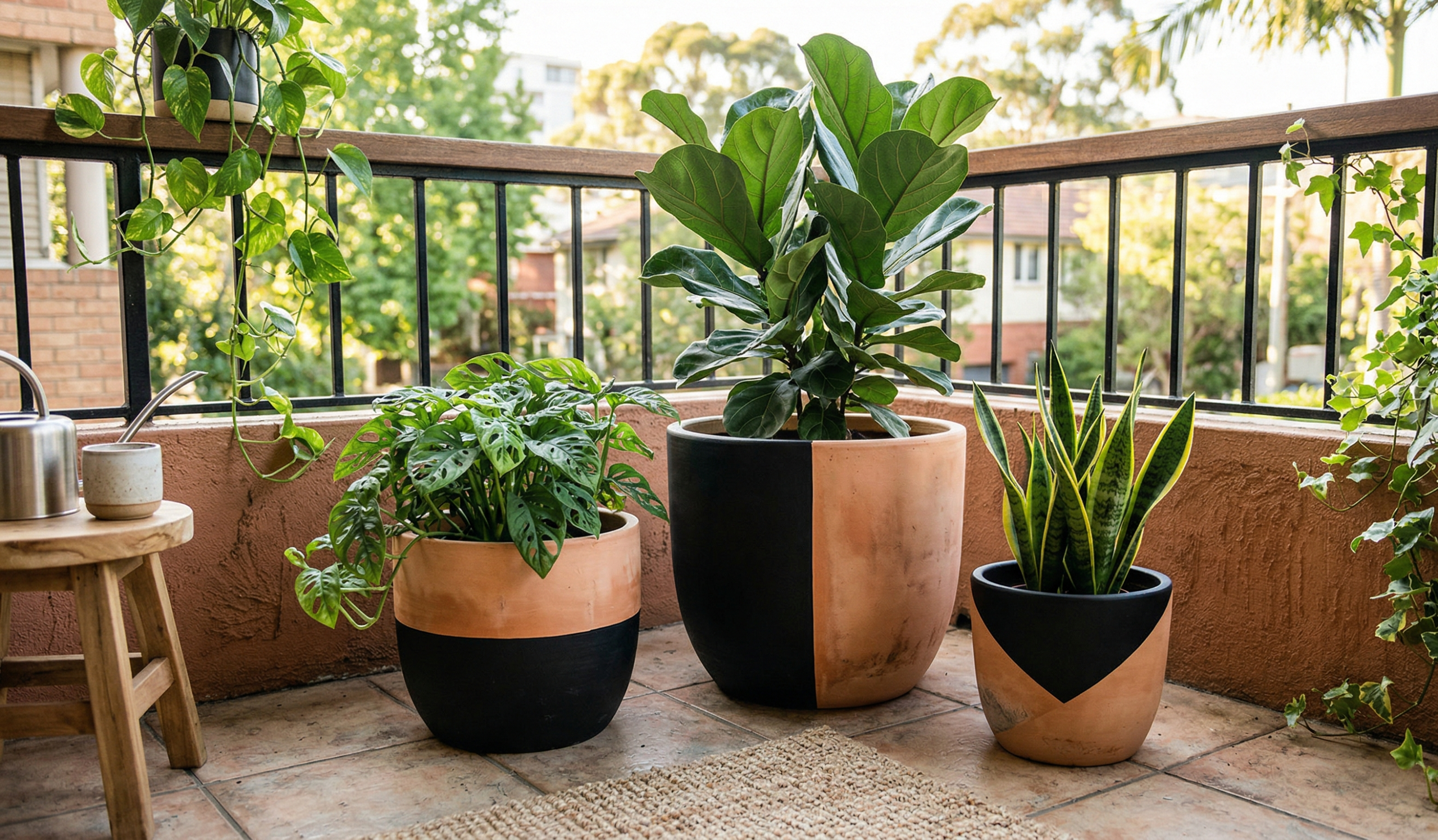
The Day I Realized My Planters Were… Kind of Boring
I didn’t notice it at first. My plants were doing fine, the balcony felt alive, and everything technically looked “nice.” But one evening, while watering my plants, I stepped back and really looked at the space… and something felt off.
All those terracotta pots? Same color. Same texture. Same… everything.
It wasn’t bad. Just… flat.
That’s when I grabbed some leftover paint from an old project, sat on the floor with one pot, and thought, let’s just try something. That one tiny experiment turned into a full weekend of painting pots—and honestly, it completely changed how my space felt.
If you’ve got plain terracotta pots lying around, you don’t need to buy anything fancy. A little paint goes a long way. And I’ll share what actually worked for me (and what didn’t).
Before You Start: A Few Things I Learned the Hard Way
I wish someone told me this before I ruined my first pot.
- Always wipe your pot clean before painting (dust ruins everything)
- Use a primer or base coat if you want colors to pop
- Acrylic paints work best (cheap and easy)
- Seal your pot if it’s going outdoors
- Don’t overthink it… the imperfect ones usually look the best
Alright, now the fun part.
Simple Yet Beautiful Designs (Perfect If You’re Just Starting)
1. Half-Dipped Paint Pots
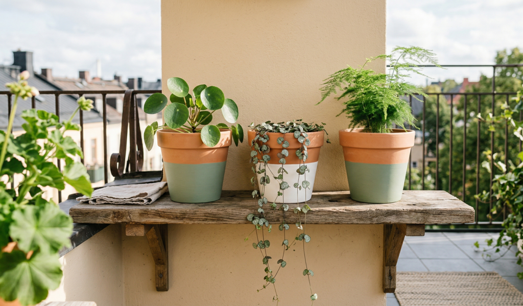
I tried this first because it felt safe. Just dip or paint the bottom half in one color. That’s it. Somehow it looks modern without trying too hard.
2. Polka Dot Pots
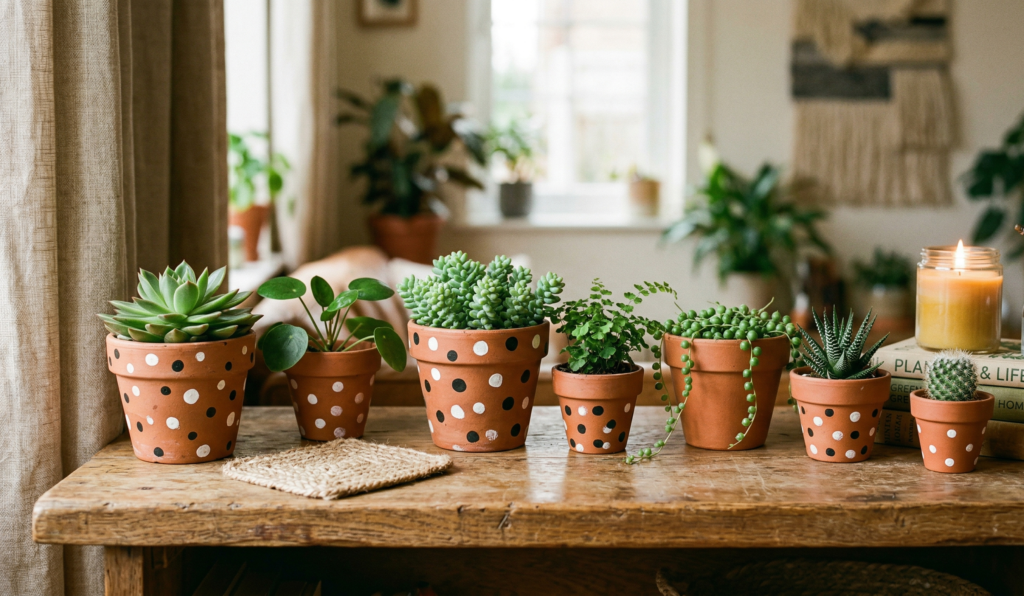
Messy dots, neat dots—both work. I used the back of a brush for this, and honestly, the uneven dots looked more charming.
3. Solid Matte Colors
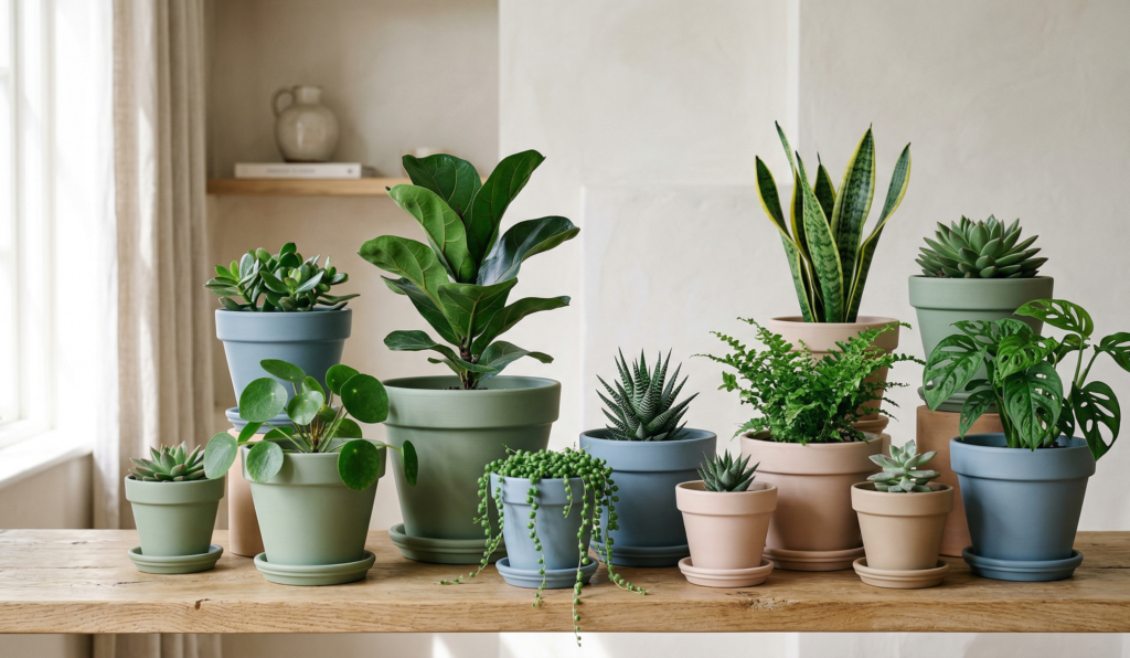
Sometimes just painting the whole pot in a soft sage green or dusty blue is enough. It instantly upgrades the look.
4. Two-Tone Contrast Pots
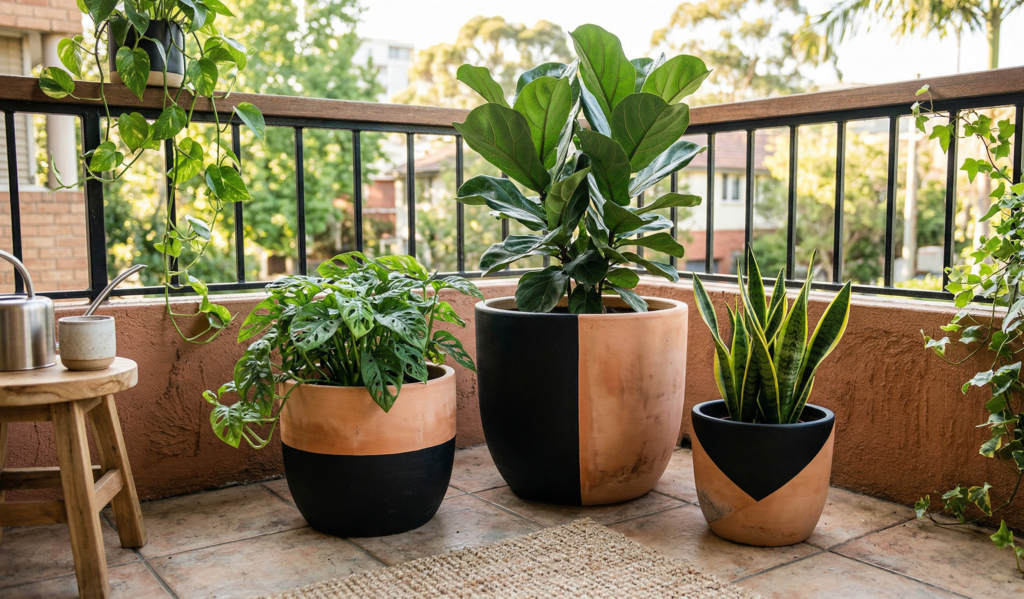
Top one color, bottom another. I did black and terracotta once—it looked surprisingly high-end.
5. Whitewashed Terracotta
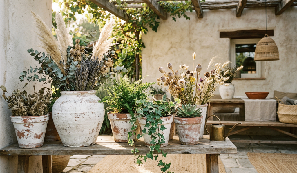
This one’s subtle. A thin wash of white paint lets the original clay peek through. It feels soft and rustic.
Patterns That Add Personality (Without Being Too Complicated)
6. Striped Pots
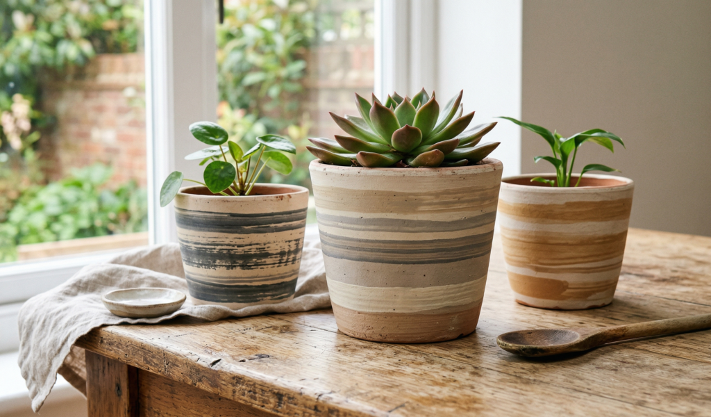
Horizontal, vertical, uneven… stripes are forgiving. I once messed up spacing and it still looked intentional.
7. Geometric Shapes
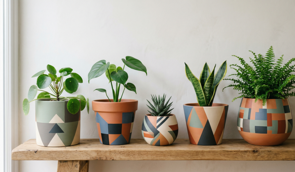
Triangles, blocks, random lines. Use tape if you want clean edges—but I usually freehand because I’m impatient.
8. Tribal or Boho Patterns
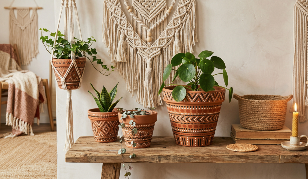
These are fun but take time. I sat with music and just kept adding lines and dots until it felt right.
9. Mandala-Inspired Designs
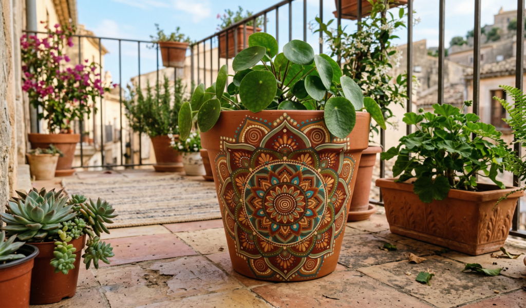
Not perfect, not symmetrical… and still beautiful. Start from the center and build outward.
10. Chevron Patterns
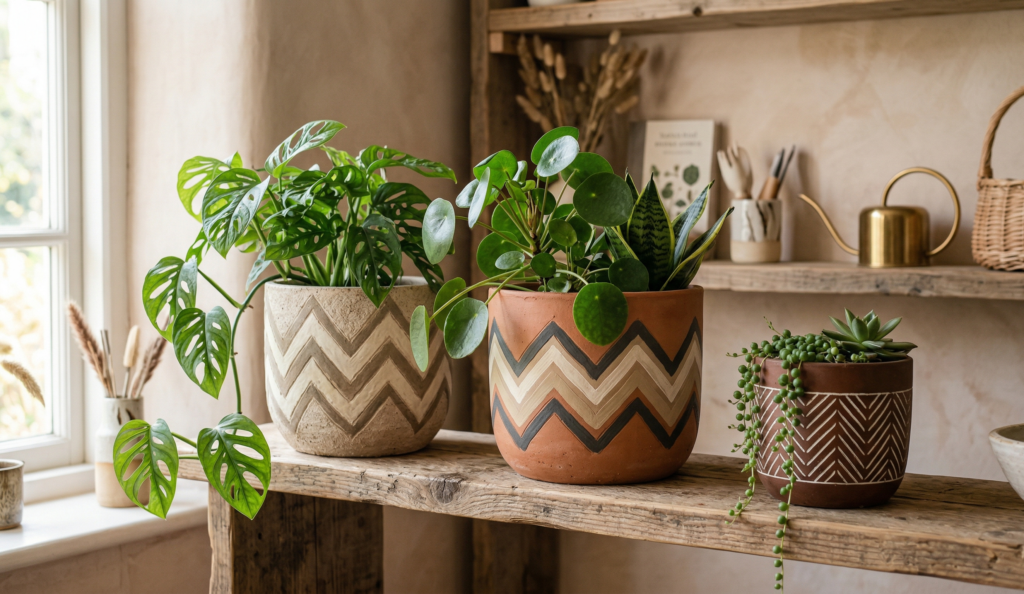
These look harder than they are. Once you get the rhythm, it’s oddly satisfying.
Nature-Inspired Ideas (These Always Feel Calm and Timeless)
11. Leaf Motifs
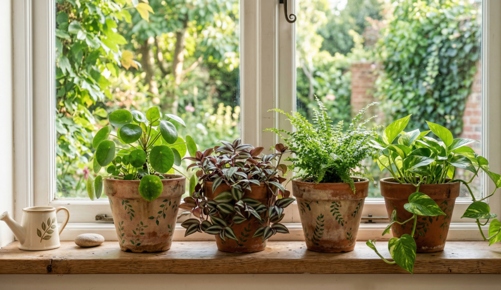
I painted tiny leaves all around one pot and placed a fern inside—it just made sense.
12. Floral Patterns
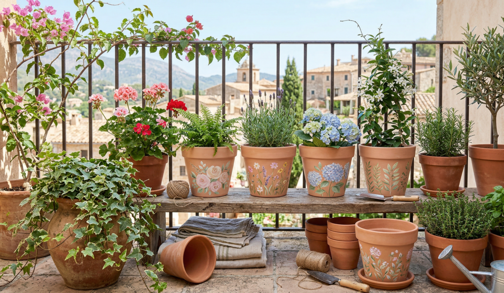
Roses, daisies, wildflowers… doesn’t have to be perfect. Mine looked slightly crooked but still cheerful.
13. Cactus Illustrations
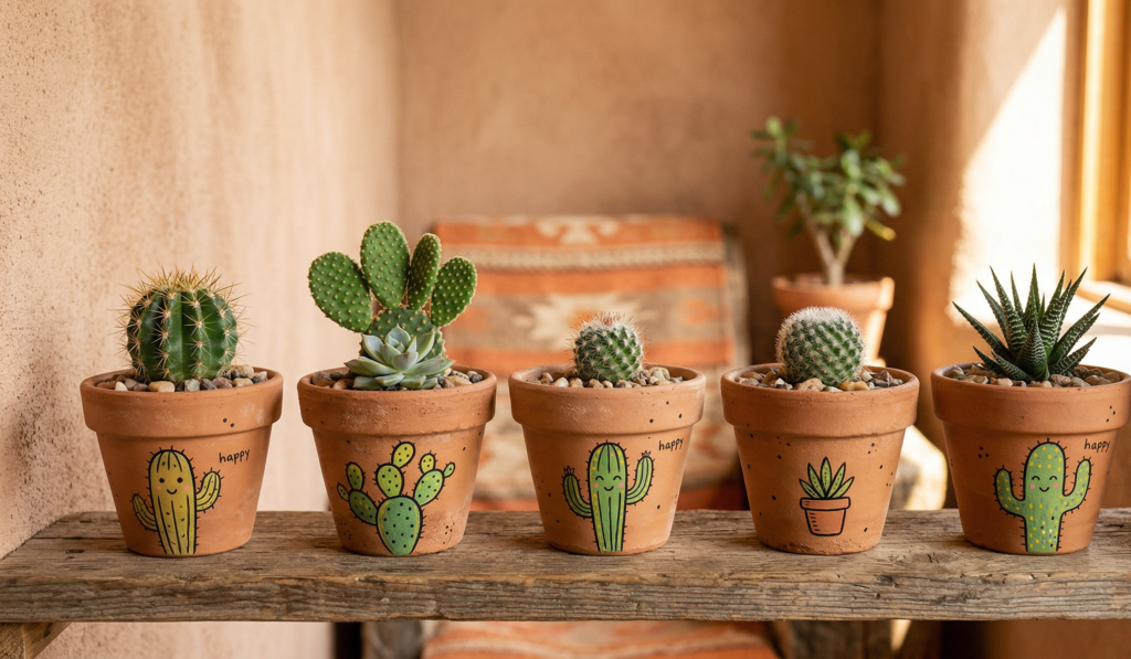
Even if your plant isn’t a cactus… it still works. A little ironic, a little fun.
14. Sun and Moon Themes
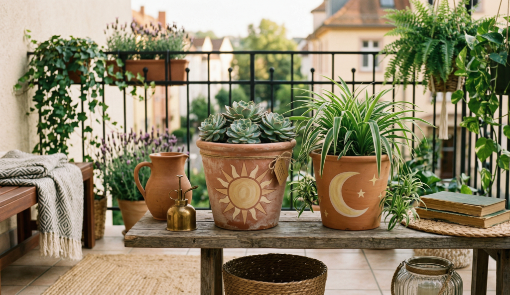
I once painted a soft yellow sun on one pot and a crescent moon on another. They looked beautiful side by side.
15. Mountain Landscapes
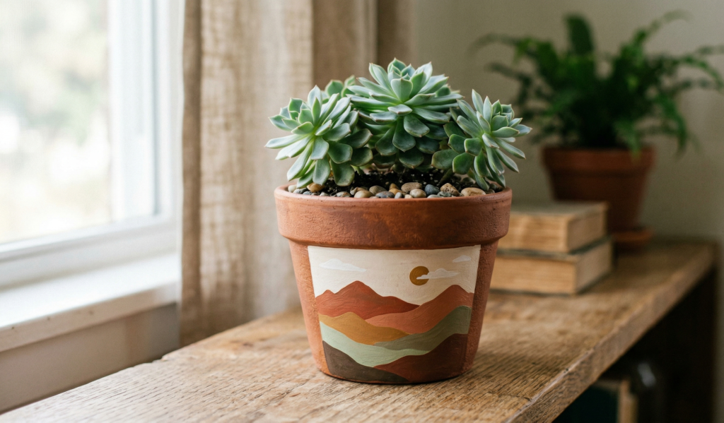
This one surprised me. Simple triangles with layered colors can look like a tiny painting.
Fun & Quirky Designs (When You Want Something Different)
16. Face Pots
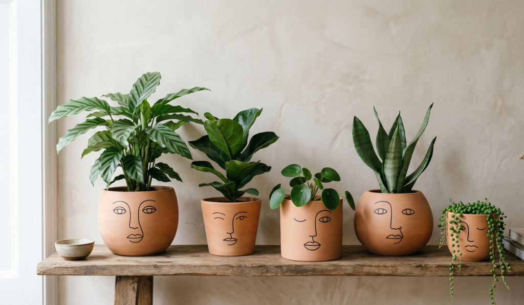
Little sleepy eyes, abstract faces… these became my favorites. They give so much personality.
17. Animal-Themed Pots
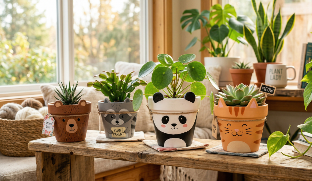
Cats, pandas, even a lazy sloth (yes, I tried that). Great if you like playful decor.
18. Color Splash Pots
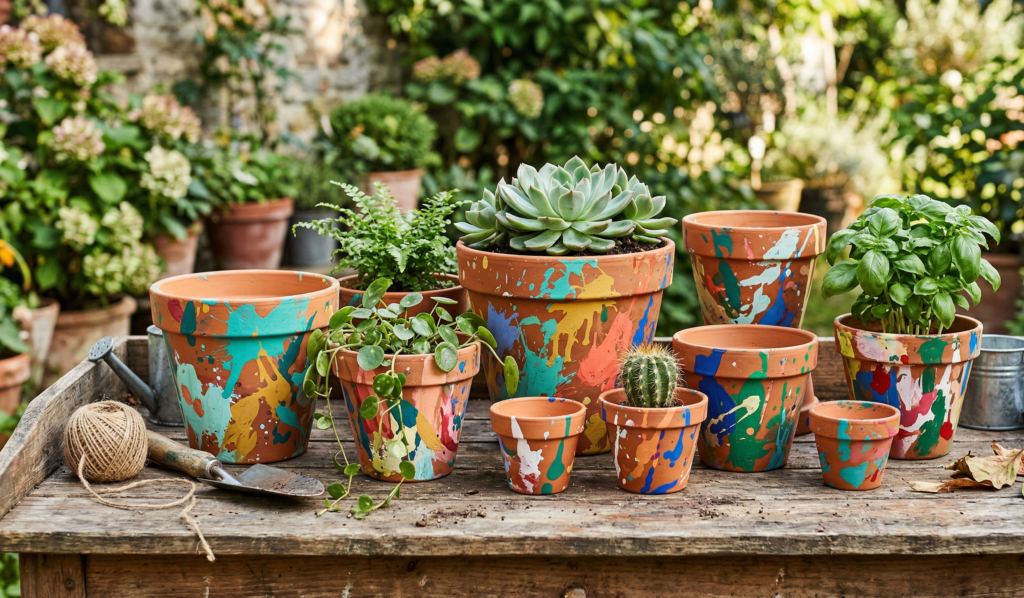
Random splashes of paint—no plan, no structure. Somehow they always look artistic.
19. Cartoon-Inspired Designs
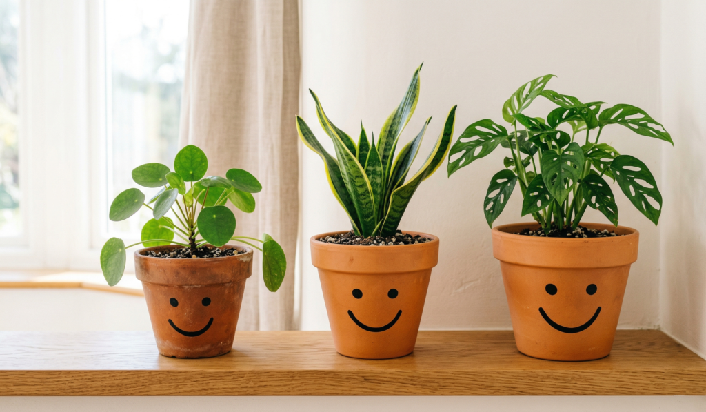
I tried a simple smiley face once, and weirdly, it became the pot everyone noticed first.
20. Text or Quotes
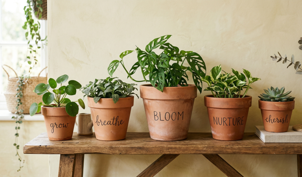
Short words like “grow,” “breathe,” or “home.” Keep it simple—it’s easy to overdo this one.
Elegant & Aesthetic Styles (If You Want That Pinterest Look)
21. Neutral Tones with Texture
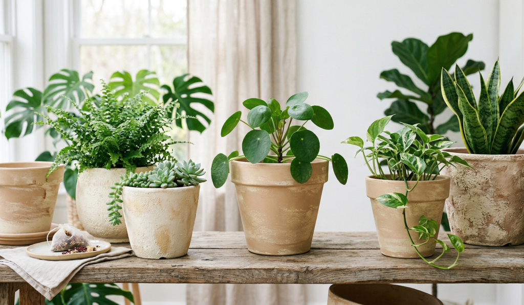
Beige, cream, soft brown… I added a little sponge texture and it looked surprisingly expensive.
22. Black and White Minimalism
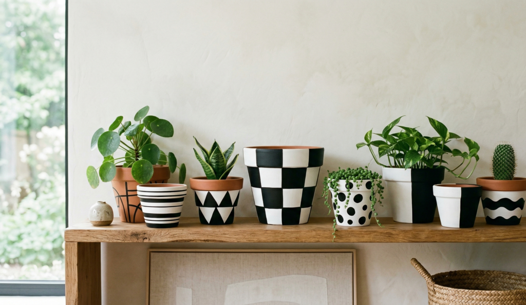
Clean, bold, timeless. You really can’t mess this up.
23. Gold Accents
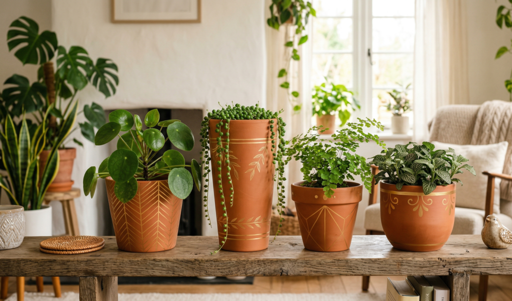
A little gold goes a long way. I added thin gold lines to one pot and suddenly it felt… fancy.
24. Ombre Effect
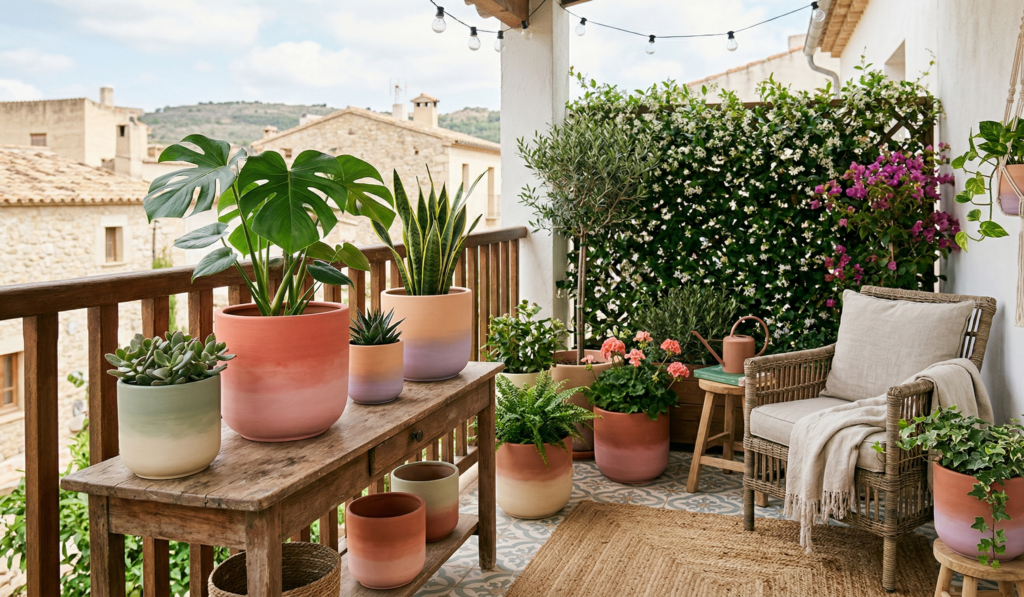
Blend one color into another. It takes patience, but the result is worth it.
25. Terracotta + Natural Mix
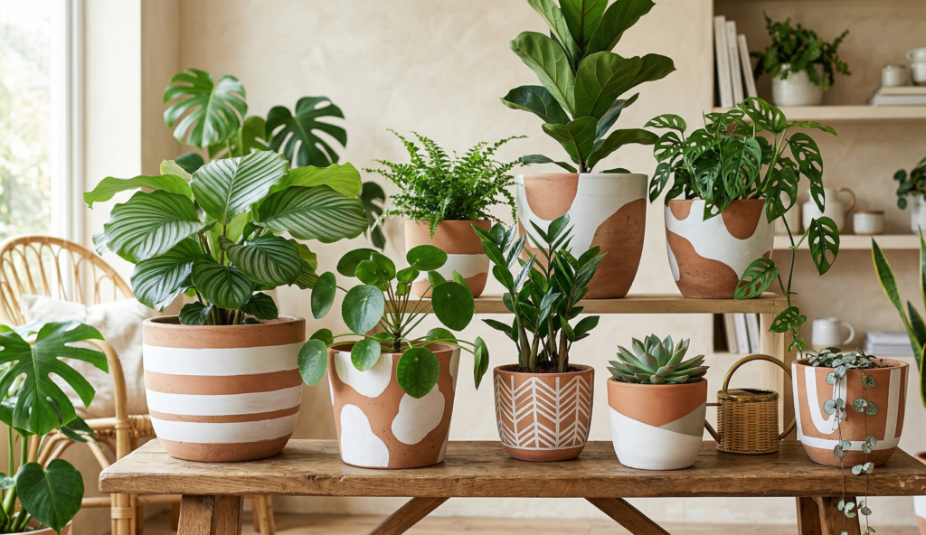
Leave some parts unpainted. That contrast between raw clay and paint is beautiful.
Small Tips That Made a Big Difference (At Least for Me)
- I started enjoying the process more when I stopped aiming for perfection
- Painting pots became weirdly relaxing… almost like therapy
- Grouping 3–5 painted pots together looks better than just one
- Even the “failed” designs somehow find a place
Also, don’t feel like you have to finish everything in one day. I stretched mine over a few evenings, and that actually made it more enjoyable.
Final Thoughts: It’s Not About the Pots
At some point, I realized this wasn’t really about decorating pots.
It was about slowing down. Sitting on the floor with paint on my hands. Not checking my phone for a while. Just… making something.
And when I placed those painted pots back in my space, it didn’t just look better—it felt more mine.
So if you’ve been thinking about trying this, just pick one pot. One color. No pressure.
That’s how it started for me too.